Color-Drenched Coffee Nook Ideas for People Done With Neutrals
One saturated color, applied wall to trim to cabinet, and no beige in sight
I painted three separate rooms in my apartment the same safe, forgettable greige, one after another, over the course of two years, genuinely believing that's what "good taste" looked like. It wasn't until I saw a photo of a small kitchen nook painted entirely, walls, trim, cabinet fronts, in one deep, saturated forest green that I understood what I'd actually been avoiding: commitment.
Color-drenching, painting every surface in a defined zone the same bold hue instead of breaking it up with white trim or a neutral ceiling, is precisely the opposite of the safe choice I kept making. And a coffee nook, small, contained, low-stakes if you genuinely hate it, turned out to be the perfect place to actually try it.
A quick note before we start: a few of the stories ahead are shared as told to me directly, and a few are offered as illustrative examples to make a principle easier to picture, I've tried to be clear about which is which rather than presenting every anecdote as independently verified. Paint names and exact formulations vary between brands, so throughout this guide I describe the tone and depth to look for rather than one universal product name.
Here are eight fully color-drenched palettes for a coffee nook, what makes each one work as a contained saturated zone, and how to actually commit to one without it overwhelming the room around it.
Table of Contents
- Deep Forest Green, Wall to Cabinet
- Burnt Terracotta and Warm Clay
- Ink Navy With Brass Hardware
- Rich Aubergine and Plum
- Warm Ochre and Mustard Gold
- Deep Chocolate Brown, Monochrome
- Burgundy and Oxblood
- Petrol Blue-Green (Teal's Sophisticated Cousin)
- What "Color-Drenching" Actually Means, and Why It Works
- How Natural Light Changes Which Palette You Should Choose
- How to Test a Full Color-Drenched Zone Before Committing
- Common Color-Drenching Mistakes
- The Full Cost Comparison
- Common Questions
Deep Forest Green, Wall to Cabinet
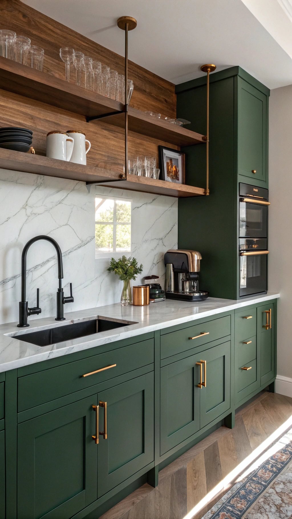
The color that started my own shift away from neutrals, and still one of the most consistently successful color-drenched choices for a coffee nook specifically. Deep forest green reads as rich and grounded rather than jarring, largely because it's close enough to a neutral in darkness and warmth that it doesn't fight with the rest of a home the way a brighter, more saturated color might.
- Choose one deep forest green, look for a color described as "hunter" or "bottle" green rather than a brighter, more yellow-leaning green.
- Apply the same color, in the same finish, to walls, trim, and any cabinetry within the defined nook zone, this consistency is the entire technique.
- Use a slightly higher sheen (satin or eggshell) on cabinetry and trim than on the walls for subtle dimension without breaking the color continuity.
- Pair with warm wood tones for open shelving or a countertop, and brass or warm gold hardware, both complement this specific green beautifully.
- Contain the drenched zone to the nook itself, letting adjacent walls return to your home's regular neutral, this containment is what keeps the technique feeling intentional rather than overwhelming.
- Reads as rich and grounded rather than jarring or overly trendy
- Pairs naturally with warm wood and brass, materials most homes already have
- Dark enough to hide daily marks and splashes well in a functional zone
Search terms: "deep forest green paint," "hunter green cabinet paint," "brass cabinet hardware"
Burnt Terracotta and Warm Clay
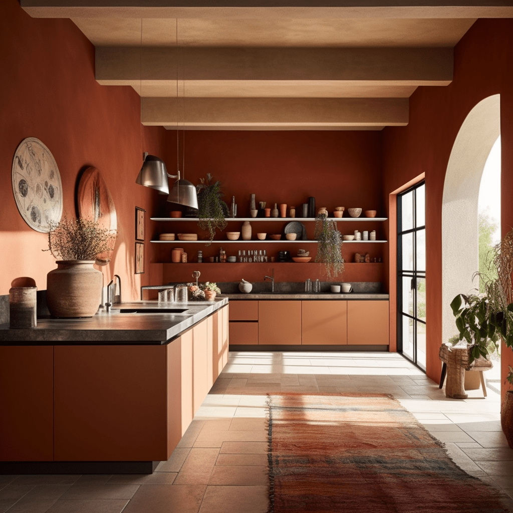
A homeowner shared that a fully terracotta-drenched nook, walls and cabinetry both in the same warm clay tone, made her small kitchen corner feel like a genuinely different climate, warm, sun-drenched, almost Mediterranean, despite the room having relatively modest natural light.
- Choose a genuinely burnt, earthy terracotta rather than a brighter, more orange-leaning version, look for "clay" or "burnt sienna" in the color name.
- Apply consistently across walls, trim, and cabinetry within the nook, exactly as with the forest green approach.
- Pair with unglazed ceramic, woven textures, and warm brass for accessories, these materials echo the color's earthy, sun-warmed quality.
- Consider a matte or low-sheen finish throughout, glossier finishes can push this specific tone toward looking more orange and less sophisticated.
- Balance with a genuinely neutral countertop, butcher block or a light stone, to keep the saturated color from feeling overwhelming at eye level.
- Delivers genuine warmth and depth, even in rooms with modest natural light
- Pairs naturally with unglazed ceramic and woven natural materials
- A less common choice than navy or green, genuinely distinctive
Search terms: "burnt terracotta paint," "clay color cabinet paint," "unglazed terracotta pot"
Ink Navy With Brass Hardware
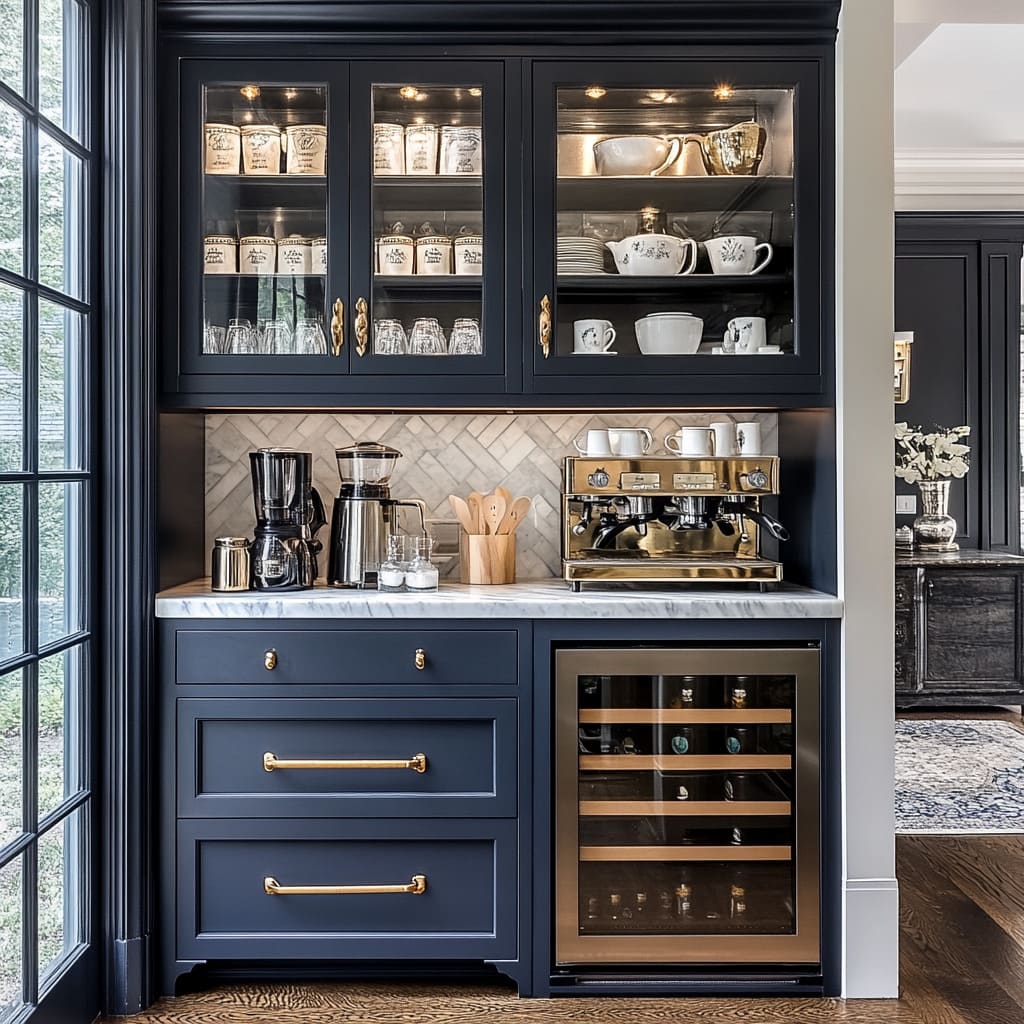
Imagine a reader who wanted genuine drama in her coffee nook without straying into a color she worried might feel dated within a few years. A deep, ink-dark navy, nearly black in low light, paired with brass hardware, gave her that drama while reading as genuinely classic rather than trend-driven.
- Choose a navy described as "ink" or "midnight" rather than a brighter "royal" or "cobalt" blue, the depth matters significantly here.
- Apply consistently to walls, trim, and cabinetry, per the core color-drenching technique.
- Pair specifically with brass or warm gold hardware and lighting, this combination is what elevates navy from simply "dark" to genuinely elegant.
- Consider a marble or light stone countertop for contrast against the deep, saturated backdrop.
- Add a warm-toned wood accent somewhere in the zone, an open shelf or a stool, to prevent the palette from reading as too cool overall.
- Reads as sophisticated and genuinely timeless, not trend-specific
- Brass hardware pairing elevates the whole palette significantly
- Broadly appealing even to household members hesitant about bold color
Search terms: "ink navy paint," "midnight blue cabinet paint," "brass cabinet pulls"
Rich Aubergine and Plum

A homeowner shared that a deep aubergine nook was the single choice on this entire list that made guests audibly react, and also the one she was most nervous about before committing, a genuinely unusual color for a kitchen zone that turned out to be one of her most complimented design decisions.
- Choose a genuinely deep aubergine or eggplant tone, close to black in low light, rather than a brighter lavender or orchid purple.
- Apply consistently across walls, trim, and cabinetry within the drenched zone.
- Pair with warm gold or brass accents specifically, this combination softens the color's intensity and adds genuine richness.
- Balance with a lighter countertop material, marble or a pale wood, to keep the overall zone from feeling too heavy at counter height.
- Test extensively in your specific lighting before committing, this is one of the color families most affected by artificial versus natural light shifts.
- One of the most distinctive, memorable choices on this entire list
- Reads as sophisticated and moody, not juvenile, at the correct depth
- Genuinely rare in kitchen design, a real point of difference
Search terms: "deep aubergine paint," "eggplant color cabinet paint," "gold cabinet hardware"
Warm Ochre and Mustard Gold

Imagine a reader who wanted her coffee nook to feel like the warmest, most energizing spot in her whole kitchen, the first place she wanted to be each morning. A fully drenched warm ochre zone, walls and cabinetry both, delivered exactly that, without ever tipping into the visual fatigue a brighter yellow might cause over time.
- Choose a color described as ochre, mustard, or warm gold rather than "sunshine" or "lemon" yellow.
- Apply consistently across walls, trim, and cabinetry within the defined nook zone.
- Pair with deep brown or charcoal accents, a dark countertop or dark hardware, to ground the warmth and prevent it from feeling too light or airy.
- Consider this palette specifically for north-facing or lower-light kitchen corners, ochre performs especially well compensating for limited natural warmth.
- Add one genuinely dark, saturated accent object, a piece of pottery, a small vase, to give the eye a resting point within the warm palette.
- Delivers genuine warmth and energy without visual fatigue over time
- Particularly effective in rooms lacking strong natural light
- Pairs beautifully with dark, grounding accents for balance
Search terms: "warm ochre paint," "mustard cabinet paint," "dark wood countertop"
Deep Chocolate Brown, Monochrome
A homeowner shared that deep chocolate brown was the palette on this list she was initially most skeptical of, associating it with dated 1990s kitchens, until she saw it applied at genuine full saturation with brass accents and realized how different it read from the muddy, mid-toned browns of that earlier era.
- Choose a color described as "espresso" or "dark chocolate" rather than a medium, warmer, more dated-reading brown.
- Apply consistently across walls, trim, and cabinetry, exactly as with the other palettes on this list.
- Pair specifically with brass and cream or ivory accents to keep the monochrome palette from feeling too heavy or cave-like.
- Add texture variation within the brown family, a woven basket, a leather accessory, rather than relying on color alone for visual interest.
- Ensure adequate task lighting directly in the nook, this deep tone benefits considerably from warm, layered light.
- Delivers deep warmth and coziness in a still broadly neutral-adjacent family
- Reads as current rather than dated at the correct depth and pairing
- Particularly forgiving of daily marks and use in a functional zone
Search terms: "espresso brown paint," "dark chocolate cabinet paint," "cream ceramic accessories"
Burgundy and Oxblood

Imagine a reader who wanted red without the visual intensity or fast-dating quality a bright, primary red often carries. A deep burgundy or oxblood tone, applied at full saturation, gave her the same warmth and richness associated with red while reading as considerably more sophisticated and stable over time.
- Choose a color described as burgundy, oxblood, or "wine" rather than "red" or "cherry."
- Apply consistently across walls, trim, and cabinetry within the drenched zone.
- Pair with black or dark bronze hardware for a moodier, more sophisticated overall effect, or brass for added warmth.
- Balance with a lighter, neutral countertop to prevent the zone from feeling too dark and heavy at eye and hand level.
- Consider this palette specifically for a nook with strong task lighting, since its depth benefits from good illumination during actual daily use.
- Delivers red-family warmth without the visual intensity of a bright primary red
- Ages more gracefully than brighter red choices
- Pairs well with both brass and black hardware, genuinely flexible
Search terms: "burgundy paint interior," "oxblood cabinet paint," "black cabinet hardware"
Petrol Blue-Green (Teal's Sophisticated Cousin)
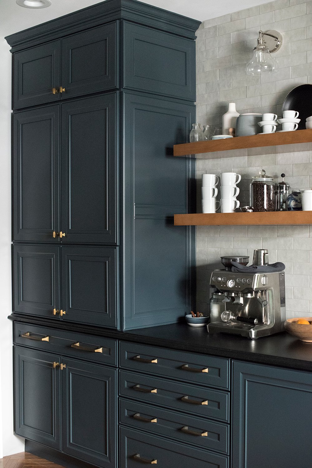
A homeowner shared that she'd wanted teal for years but worried it would read as overly bright or trend-driven. A deeper, more muted "petrol" version, closer to a dark, industrial blue-green than a bright turquoise, gave her the color family she wanted with considerably more sophistication and staying power.
- Choose a color described as petrol, dark teal, or deep blue-green rather than a brighter "turquoise" or "aqua."
- Apply consistently across walls, trim, and cabinetry within the defined zone.
- Pair with warm brass and natural wood accents specifically, this combination is what elevates the color beyond a simpler, more novelty-feeling bright teal.
- Consider a marble or pale stone countertop for genuine contrast against the deep, saturated backdrop.
- Test in your specific lighting extensively, this color family shifts meaningfully between cool daylight and warmer artificial evening light.
- Delivers teal's visual interest without the brightness that dates quickly
- Genuinely distinctive from the more common navy or forest green choices
- Pairs beautifully with brass for a sophisticated, elevated final look
Search terms: "petrol blue paint," "dark teal cabinet paint," "marble look countertop"
What "Color-Drenching" Actually Means, and Why It Works
Color-drenching specifically refers to applying one single, saturated color across every surface in a defined zone, walls, trim, and cabinetry together, rather than the more traditional approach of a colored wall paired with white or neutral trim. This matters because trim and cabinetry breaks are what typically create visual "stopping points," edges where the eye registers a boundary and the room reads as segmented into pieces. Removing those breaks, letting one continuous color wrap the entire zone, has the counterintuitive effect of making even a small, contained space feel larger and more immersive rather than boxed in, since there's no hard edge interrupting the color's flow. This is precisely why every palette throughout this guide specifies applying the same tone to walls, trim, and cabinetry together, that consistency is the entire technique, far more than the specific color chosen. A muted, sophisticated color applied with genuine consistency will always outperform a more exciting color applied only to walls while trim stays a contrasting white.
How Natural Light Changes Which Palette You Should Choose
- North-facing, cooler, more limited natural light: warm ochre, terracotta, or deep chocolate brown perform best, actively compensating for the room's inherent coolness.
- South-facing, abundant warm natural light: nearly every palette on this list performs well, though cooler tones like petrol or ink navy benefit especially from the added warmth.
- East-facing, strong cool morning light: forest green and navy hold their intended depth particularly well under this specific light quality.
- West-facing, strong warm evening light: aubergine and burgundy can shift noticeably warmer and richer in late-day light, worth testing specifically at that time if this is your room's orientation.
- Rooms relying mainly on artificial light: prioritize warm-bulb testing over daylight testing, since this is the lighting condition the color will actually be seen under most often.
How to Test a Full Color-Drenched Zone Before Committing
Because color-drenching involves committing paint to walls, trim, and cabinetry together, testing matters more here than with a single accent wall decision. Paint genuine sample patches, at least two feet square, on both a wall section and, if possible, a piece of scrap wood or cardboard representing the cabinetry finish, rather than relying on a small paint chip alone. View both samples together, side by side, across a full day's natural light and your evening artificial lighting, confirming the two surfaces genuinely coordinate rather than reading as two subtly different colors. Live with the samples in place for at least three to five days before committing to full application, the intensity of a fully saturated color, once actually seen daily rather than in a single dramatic moment, sometimes shifts a person's confidence in either direction, and it's far better to discover that before painting cabinetry than after.
Common Color-Drenching Mistakes
- Painting walls but leaving trim or cabinetry white: breaks the immersive effect that makes color-drenching work in the first place.
- Choosing a color based on a photo taken in different lighting: the same undertone-testing principle that applies to any paint choice matters even more at full saturation.
- Skipping the containment boundary: letting a drenched zone bleed into adjacent walls without a clear, intentional stopping point.
- Choosing hardware and accents that clash with the palette's undertone: cool-toned silver hardware against a warm terracotta wall, for example, undermines an otherwise cohesive choice.
- Rushing the decision without living with samples first: the single most common source of regret with any fully saturated color commitment.
The Full Cost Comparison
| Item | Typical Cost |
|---|---|
| Sample pot (per color tested) | $6–14 |
| One quart, walls + trim (small nook zone) | $25–45 |
| Cabinet-grade paint (if painting existing cabinetry) | $30–60 |
| Brass or gold hardware swap | $20–50 |
| Full color-drenched nook, materials only | Typically $100–200 total |
Common Questions
Which of these eight palettes is the safest starting point for someone new to bold color? Ink navy and deep forest green are generally the most broadly appealing and least risky entry points, while aubergine and burgundy carry the most distinctive, higher-commitment feel.
Does color-drenching work on a small budget console-style nook, or only full cabinetry? The technique applies equally well to any surfaces within the zone, walls, trim, and even a painted secondhand console piece, full built-in cabinetry isn't required.
Will a fully saturated nook hurt resale value? Since the technique is typically contained to a small, defined zone rather than an entire kitchen, most buyers and appraisers treat it as a distinctive design feature rather than a liability, though genuinely risk-averse sellers may prefer to repaint before listing.
How do I keep the rest of my kitchen from feeling disconnected from one bold nook? Repeat one small element from the drenched palette elsewhere in the kitchen, the same brass hardware finish, a single accent object in the same color family, this creates a subtle thread connecting the bold zone to the rest of the space.
Can I combine two colors from this list rather than choosing just one? The core color-drenching technique specifically relies on one consistent color for its immersive effect; combining two saturated colors is a different, more advanced technique better suited to a separate project than a first attempt at this specific style.
A coffee nook was never actually required to play it safe just because the rest of a home leans neutral. Every palette here proves the same point: full commitment to one saturated color, applied consistently rather than broken up by white trim, is what actually makes a small space feel intentional and rich, not overwhelming.
Start with the free step this weekend, paint two matching samples, wall and cabinet, side by side, and live with them for a few days before deciding whether you're finally ready to be done with neutrals.
Shop the Story
- deep forest green paint
- burnt terracotta paint
- ink navy paint
- deep aubergine paint
- warm ochre paint
- espresso brown paint
- burgundy paint interior
- petrol blue paint
- brass cabinet hardware
- black cabinet hardware