Home Design That Feels Considered, Not Expensive
Real designer techniques, budget-tested and rewritten for the rest of us — no showroom required.
Browse the GuidesLatest Guides

10 Designer Tricks That Make a Room Look Expensive for Under $50
The exact changes that made friends ask if I'd hired a designer, none of them cost more than dinner out.
Read the Guide →
8 Lighting Mistakes Making Your Home Look Cheaper Than It Is
Lighting shapes how a room feels more than almost anything else, and it's the cheapest fix on this whole list.
Read the Guide →10 Thrift Store Finds That Look High-End When You Style Them Like This
What a designer sees in the same aisles everyone else walks past, and exactly how to style each find.
Read the Guide →
10 Kitchen Updates Under $100 That Look Like a Full Remodel
A full remodel was never the only path to a designer kitchen, ranked by priority if your budget is tight.
Read the Guide →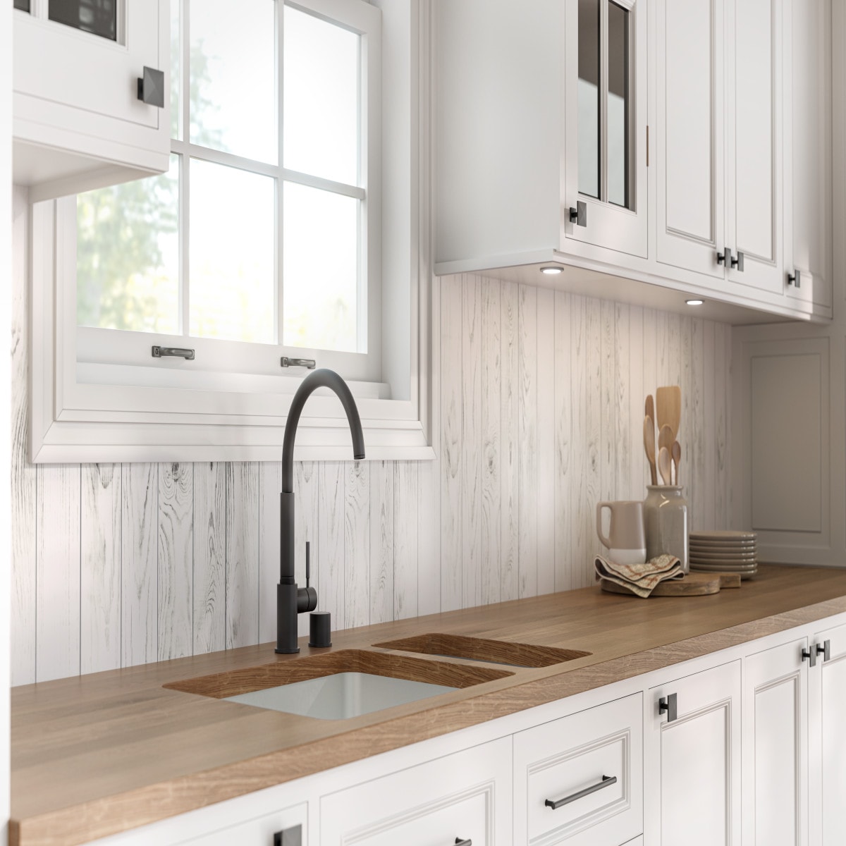
7 Backsplash Alternatives That Cost Less Than Tile But Look Just as High-End
Skip the grout and the installer, ranked by heat resistance and install difficulty.
Read the Guide →
11 Coffee Table Styling Tricks Designers Swear By
The handful of repeatable formulas, not talent, that turn any table into a room's focal point.
Read the Guide →
9 Gallery Wall Layouts That Look Custom-Curated, Not Cluttered
Real layout formulas, planned on paper before a single nail goes in the wall.
Read the Guide →
6 Small Entryway Ideas That Make a Tiny Foyer Feel Designed
An entryway's real job was never about square footage, it's about whether it has an actual system.
Read the Guide →
8 Home Office Upgrades Under $60 That Look Like a Pinterest Dream
A handful of small, specific choices, most under $15 each, changed how the whole corner felt.
Read the Guide →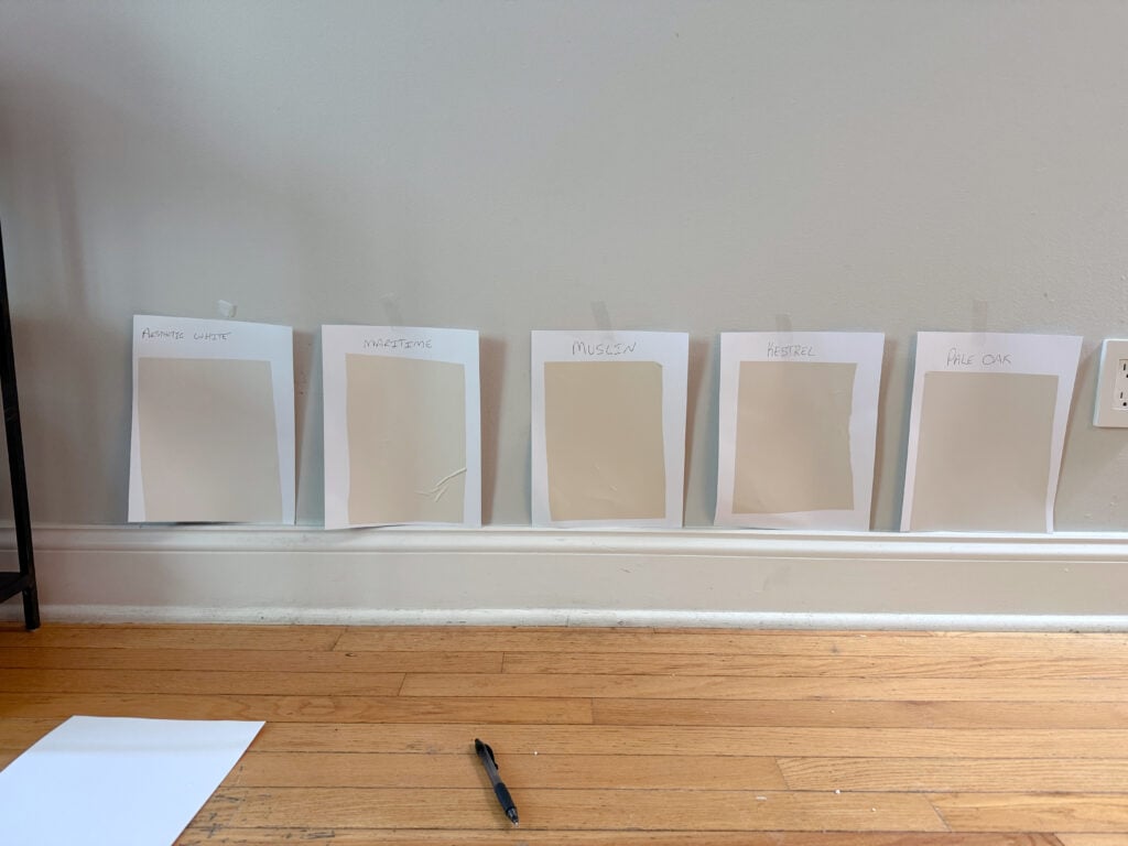
9 Paint Colors Designers Never Use (And What They Pick Instead)
It usually isn't the color itself, it's the undertone, tested in your own light before you buy the gallon.
Read the Guide →
8 Curtain Hanging Mistakes That Make Ceilings Look Shorter
How mounting height changes a ceiling's perceived height in seconds, no construction required.
Read the Guide →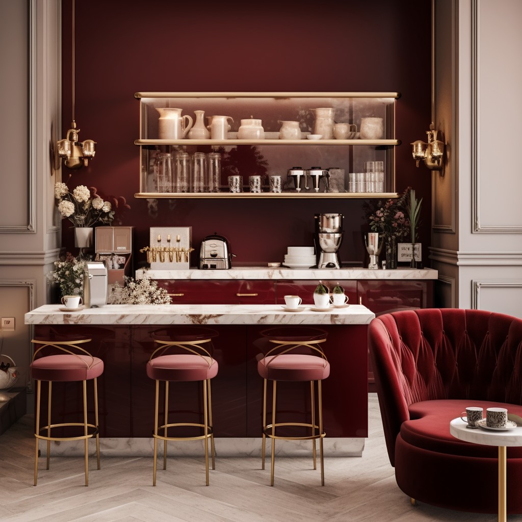
Color-Drenched Coffee Nook Ideas for People Done With Neutrals
One saturated color, applied wall to trim to cabinet, and no beige anywhere in sight.
Read the Guide →7 Things Interior Designers Remove From Every Living Room

7 Things Interior Designers Remove From Every Living Room (And What They Use Instead)
Discover the 7 things interior designers remove from every living room, why each one quietly makes a space feel cheaper, and exactly what to use instead, on any budget.
The first time I visited the home of a friend who had recently hired an interior designer, I expected to see expensive furniture everywhere. Instead, I kept noticing what was missing.
The room felt calmer. Brighter. More welcoming. Nothing screamed for attention, yet everything worked together beautifully, in a way I couldn't quite explain at first. I remember standing in the doorway for a moment longer than necessary, trying to figure out what, exactly, had changed since I'd last visited.
When I finally asked what had changed, the answer surprised me. "We didn't buy very much," the designer said. "We mostly removed the things that were fighting the room."
That conversation completely changed how I think about decorating. A quick note before we begin: some of the homeowner stories ahead are shared as told to me directly, and a few are offered as illustrative examples to make a principle easier to picture. I've tried to be clear about which is which rather than presenting every anecdote as an independently verified account.
Many of us assume a beautiful living room comes from buying more. But experienced designers often begin by editing. They remove visual clutter, awkward proportions, outdated accessories, and small details that quietly make a room feel cheaper than it really is, long before they add a single new item.
The good news is that most of these changes cost little, or nothing at all. In this guide, I'll walk you through seven things professional interior designers almost always remove from a living room, explain why each one affects the space, share real decorating experiences, and show you exactly what to use instead.
Table of Contents
- Tiny Rugs That Float in the Middle of the Room
- Furniture Pushed Flat Against Every Wall
- Cool White Overhead Lighting
- Undersized, Timid Wall Art
- Mismatched, Overcrowded Throw Pillows
- Fake-Looking Artificial Plants
- Overcrowded, Cluttered Surfaces
- The Psychology of Why Removing Beats Adding
- One Living Room, All Seven Fixes: A Full Case Study
- The Designer Checklist
- The Budget Shopping Guide
- A 30-Day Living Room Reset Plan
- The Real Cost Comparison
- Common Questions
- Final Takeaway
1. Tiny Rugs That Float in the Middle of the Room
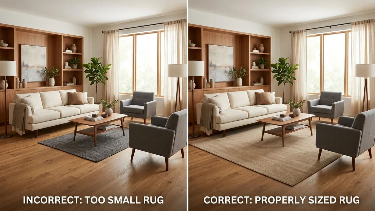
If there's one decorating mistake I see over and over again, it's a rug that's simply too small.
At first, it seems like a smart way to save money. After all, a smaller rug costs less. But the moment you place it in a living room, the furniture begins to feel disconnected, almost like each piece is standing on its own little island, with the rug doing nothing to hold the room together.
Why designers remove it: a rug's job isn't just softness underfoot, it's to visually anchor the entire seating area into one cohesive space. A rug too small to reach any furniture creates a hard, isolated boundary in the middle of the room, which paradoxically makes the whole space feel smaller and more fragmented, not more open.
- Measure your full seating arrangement, sofa, chairs, and coffee table together, not just the open floor space between them.
- Choose a rug size where at minimum the front legs of every major piece can rest on it.
- If a larger rug isn't in budget yet, prioritize width over length, or consider layering a larger, inexpensive jute rug beneath your current one.
- Center the rug on the seating arrangement as a whole, not the exact geometric center of the room.
- Live with the new size for a week before making any further furniture changes, sometimes the rug alone resolves an issue you'd been trying to fix with furniture rearrangement.
A homeowner's experience: when Emily, a first-time homeowner, replaced her 5x7 rug with an 8x10 version, she expected only a subtle improvement. Instead, she told me it felt as though someone had quietly renovated the entire room. Friends assumed she'd bought new furniture, even though the sofa, coffee table, and chairs hadn't changed at all. The larger rug simply brought everything together.
- Makes the room feel smaller, not larger, despite the smaller size
- Breaks the visual flow between furniture pieces
- Leaves furniture looking disconnected, like separate islands
- Creates awkward empty borders around the seating area
What designers use instead: a rug large enough that at least the front legs of every major seating piece rest comfortably on it. In larger rooms, allowing all four legs of each piece to sit on the rug creates an even more grounded, luxurious look.
Quick Designer Fix: if replacing the rug isn't possible right now, layer a larger neutral jute rug underneath your existing one. It adds size, texture, and warmth for much less than buying a brand-new oversized rug outright.
Product suggestions: large neutral wool or jute rug, rug pad, rug tape for securing edges
2. Furniture Pushed Flat Against Every Wall

I used to think pushing furniture against every wall was simply the responsible, space-maximizing thing to do, especially in a smaller room. It felt intuitive: more open floor space in the middle must mean a bigger-feeling room.
Why designers remove it: furniture lined up against every wall creates what designers sometimes call the "waiting room effect," a large, dead, unused void sits in the center of the room while all the actual living happens around the awkward perimeter. It also forces conversation across an unnecessarily large gap, making even a full room feel oddly disconnected.
- Identify your room's actual focal point, a fireplace, a window view, a TV, and orient the main seating toward it rather than toward the walls.
- Pull the sofa away from its wall by at least 6 to 12 inches, even in a smaller room.
- Angle chairs slightly inward toward the sofa and coffee table, rather than facing straight ahead at a blank wall.
- Measure the distance between primary seating pieces, aim for 8 feet or less between pieces meant for conversation.
- Fill the newly available space behind a floated sofa with a slim console table rather than leaving it empty, which completes the "sofa as room divider" look designers often use in open-plan spaces.
A homeowner's experience: a homeowner named Priya told me she'd arranged her entire living room against the walls for nearly three years, assuming it was the only "correct" way to fit everything in a modestly sized space. When a friend who'd studied design suggested floating the sofa just a few feet from the wall and angling two chairs toward it, she said the room felt "used" for the first time, like it was actually designed for people to sit and talk, not just to store furniture.
- Creates a large, awkward dead zone in the center of the room
- Forces conversation across an unnecessarily wide gap
- Makes the room feel like a waiting area rather than a living space
- Wastes the room's most usable central space on empty floor
What designers use instead: furniture arranged to create an intimate, functional conversation area, even if that means floating the sofa away from the wall and leaving some open space behind it instead of in front of it.
Quick Designer Fix: even pulling a sofa just 6 to 12 inches off the wall, without a full rearrangement, adds a sense of depth and intentionality that a flush-against-the-wall layout can't achieve.
Product suggestions: a slim console table for the newly created space behind a floated sofa, felt furniture pads for easier repositioning
3. Cool White Overhead Lighting
For years, I assumed lighting was purely functional, brighter simply meant better, and one strong ceiling fixture should be enough for any room. I never considered that the color and source of that light might be working directly against everything else I was trying to create.
Why designers remove it: cool white and daylight-toned bulbs, especially from a single overhead source, cast the exact quality of light associated with offices, hospitals, and retail stores. It's efficient, but it's rarely the tone anyone associates with comfort, warmth, or rest, the emotional qualities a living room is actually meant to provide.
- Check the Kelvin (K) rating on your current bulb packaging or base.
- Replace any bulb reading 4000K or higher with a 2700K to 3000K warm white equivalent.
- Add at least one additional light source at a lower height, a floor lamp or table lamp, rather than relying on the ceiling fixture alone.
- Turn off the overhead light for one evening entirely and rely only on lamps, noting which areas still feel underlit.
- Add a plug-in dimmer to your primary lamp for further control between daytime brightness and evening warmth.
A homeowner's experience: a homeowner named Daniel told me he spent months trying to figure out why his tastefully furnished living room still felt somehow unfinished and cold. It wasn't the furniture at all, every bulb in the room happened to be a leftover cool white bulb from a builder's multipack. Once he swapped them for warm white bulbs and added two lamps, he said guests started commenting on how "cozy" the exact same furniture suddenly felt.
- Casts a clinical, sterile tone associated with offices and retail spaces
- Creates flat, even brightness with none of the depth layered light provides
- Makes furniture, skin tones, and wood finishes look cooler and less inviting
- Relies on a single source, leaving corners of the room in harsh contrast rather than gentle shadow
What designers use instead: warm white bulbs (generally 2700K to 3000K) layered across multiple sources, floor lamps, table lamps, and only supplemental use of overhead lighting, rather than overhead light as the room's sole source.
Quick Designer Fix: if you can only change one thing tonight, swap your main lamp's bulb to warm white and turn off the overhead light entirely for the evening, then compare how the room feels.
Product suggestions: warm white LED bulbs (2700K), floor lamp with fabric shade, ceramic table lamp
4. Undersized, Timid Wall Art

I used to buy art based purely on what I liked in the moment, without ever considering the actual wall it would eventually hang on. A piece that looked lovely in a shop often looked lost and accidental once mounted above my sofa at home.
Why designers remove it: undersized art leaves an excess of bare wall around it, which reads as an afterthought rather than an intentional design choice, regardless of how beautiful the piece itself actually is. Scale, not just style, determines whether art elevates a room or quietly undermines it.
- Measure the width of the furniture piece the art will hang above, typically a sofa or console.
- Aim for art spanning roughly two-thirds of that width, a common designer guideline that reliably reads as well-proportioned.
- Before buying anything, cut a piece of butcher paper or taped-together newspaper to your intended size and tape it to the wall to preview scale.
- Hang the finished piece with its center at approximately eye level, generally 57 to 60 inches from the floor, rather than centered on the overall wall height.
- If a single large piece isn't affordable yet, group several smaller pieces tightly together, treating the cluster as one larger visual unit.
A homeowner's experience: a homeowner named Marcus told me he'd owned the same small framed print above his sofa for four years, always sensing something was slightly "off" about the wall without being able to name it. A designer friend pointed out the piece was roughly a third of the size it needed to be for that wall. Swapping it for one large-format print, printed inexpensively and self-framed, transformed the entire room in an afternoon.
- Leaves an excess of bare, awkward wall space around the piece
- Reads as accidental or unfinished rather than intentional
- Fails to anchor the furniture arrangement below it visually
- Makes even beautiful individual art feel lost and underwhelming
What designers use instead: art sized to span roughly two-thirds of the furniture's width beneath it, hung with its center at approximately eye level, rather than centered on the wall itself.
Quick Designer Fix: hold a large sheet of butcher paper or newspaper cut to your intended art size up to the wall before buying anything, this instantly reveals whether a piece will actually read as appropriately scaled once hung.
Product suggestions: large black or natural wood frame, printable abstract or botanical wall art, picture hanging kit, museum putty
5. Mismatched, Overcrowded Throw Pillows

I used to accumulate pillows the way some people accumulate books, one at a time, each purchased independently, none of them chosen with the others in mind. Eventually my sofa looked less like a considered design choice and more like the collected result of several unrelated impulse buys.
Why designers remove it: a sofa crowded with mismatched pillows in competing patterns, sizes, and colors creates visual noise that fights for attention rather than inviting someone to actually sit down and relax. More pillows rarely reads as more luxurious, it usually reads as more cluttered.
- Remove every pillow from your sofa and lay them out where you can see them all at once.
- Choose your two to four favorite pillows that share a color family or complementary texture.
- Place the largest pillows at the outer edges of the sofa, angled slightly rather than squared perfectly.
- Layer a smaller accent pillow or two toward the center only if the sofa is large enough to support it without crowding.
- Store or donate the remainder rather than rotating the full collection back in later.
A homeowner's experience: a homeowner named Sarah told me she used to keep every pillow she'd ever been gifted or purchased on her sofa at once, six in total, no two matching. She said reducing to just two larger, complementary pillows felt almost too simple to make a difference, until guests started specifically commenting on how "put together" her living room suddenly looked, despite nothing else in the room changing.
- Creates visual clutter that competes with the sofa itself for attention
- Mismatched patterns and sizes read as accumulated rather than curated
- Makes an otherwise well-chosen sofa look busier and less intentional
- Leaves little visible seating space, undermining the room's actual function
What designers use instead: two to four pillows maximum per sofa, in complementary (not necessarily matching) textures and a cohesive color family, angled naturally rather than perfectly squared.
Quick Designer Fix: remove every pillow from your sofa right now, then add back only your two favorites, angled slightly at opposite ends. Notice the difference before deciding whether to buy anything new at all.
Product suggestions: textured linen pillow covers, chunky knit pillow cover, velvet lumbar pillow cover
6. Fake-Looking Artificial Plants
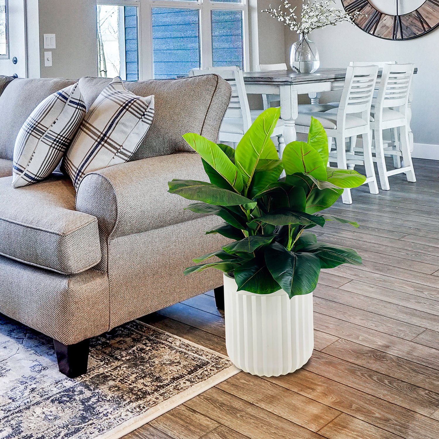
I bought my first artificial plant assuming it would look nearly identical to a real one, at a fraction of the maintenance. Instead, its uniformly glossy, perfectly symmetrical leaves made an entire corner of my living room look noticeably cheaper than the empty space it replaced.
Why designers remove it: poor-quality artificial greenery, with unnaturally uniform leaf shape, an overly glossy plastic sheen, or a symmetry no real plant actually has, reads as artificial from across the room, undermining the warmth and life real or high-quality faux greenery is meant to add in the first place.
- Assess your current artificial plants under natural daylight, glossy, uniform leaves are far more obvious in daylight than under evening lamp light.
- For plants you're keeping, dust thoroughly, dust buildup is one of the fastest ways a faux plant reads as neglected rather than intentional.
- Consider replacing your single most visible plant first, rather than all of them at once, prioritizing impact over completeness.
- If shifting to a real plant, match it honestly to your room's actual light level rather than the plant you find most aesthetically appealing.
- Water only when the top inch of soil feels dry for most common low-maintenance varieties, overwatering causes more plant deaths than neglect does.
A homeowner's experience: a homeowner named Aisha told me she'd avoided real plants entirely for years, certain she'd kill anything green within weeks. A designer she consulted pointed out that her existing artificial plant, while low-maintenance, was actually working against the room's warmth, its shiny, uniform leaves caught light in a way that read as obviously synthetic. She swapped it for a higher-quality faux plant with matte, varied leaf texture, and later added one genuinely low-maintenance real plant alongside it.
- Uniformly glossy leaves catch light in a way real foliage never does
- Perfect symmetry reads as artificial from across a room
- Undermines the warmth greenery is meant to add rather than enhancing it
- Can make an entire corner look cheaper than simply leaving it empty
What designers use instead: either genuinely low-maintenance real plants (pothos, snake plants) suited to the room's actual light, or higher-quality faux greenery with matte finishes and naturally varied, asymmetrical leaf placement.
Quick Designer Fix: if you already own a glossy, obviously artificial plant, a light dusting is essential, but consider relocating it to a less prominent corner and prioritizing one real, low-maintenance plant for your most visible spot instead.
Product suggestions: pothos plant, snake plant, high-quality matte-finish faux plant, woven plant basket
7. Overcrowded, Cluttered Surfaces
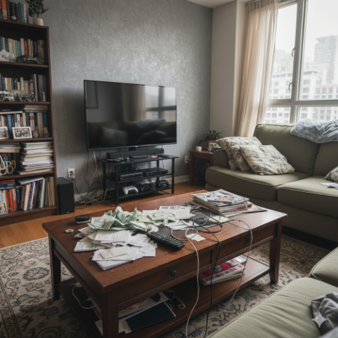
For a long time, I treated every flat surface in my living room, the coffee table, the console, open shelving, as available real estate for whatever needed a temporary home: mail, chargers, remotes, half-read magazines. Over months, "temporary" became permanent clutter.
Why designers remove it: cluttered surfaces read as chaotic and unfinished regardless of how nice the underlying furniture actually is. Visible empty space, deliberately left open, is one of the clearest, most consistent signals of an intentionally designed room, while a fully packed surface undercuts even genuinely beautiful individual pieces.
- Remove everything currently on your main surfaces, coffee table, console, open shelves.
- Create one specific, hidden landing spot elsewhere, a drawer or closed basket, exclusively for daily clutter like mail and remotes.
- Return only one or two intentional objects per surface, a tray, a candle, a small stack of books.
- Build a nightly two-minute habit of clearing surfaces back to their intentional state, rather than treating this as a one-time deep clean.
- Revisit after two weeks and notice which "essential" items you've actually missed, most people find it's fewer than expected.
A homeowner's experience: a homeowner named Robert told me his coffee table had become a permanent landing zone for mail and remotes for so long he'd stopped noticing it entirely, until a visiting friend gently pointed it out. He created one small hidden drawer specifically for that daily clutter, then styled the coffee table with just a tray and one stack of books. He said it was the single cheapest change he made in his entire living room, and arguably the most noticeable.
- Reads as chaotic and unfinished, regardless of furniture quality
- Leaves no visible empty space, which undercuts a sense of intentional design
- Makes individually nice objects feel lost in overall clutter
- Signals a lack of a designated "home" for everyday items
What designers use instead: one or two intentional objects per surface, a tray, a candle, a small stack of books, with a separate, hidden landing spot elsewhere specifically for daily clutter like mail and remotes.
Quick Designer Fix: clear one surface completely tonight and leave it empty for 48 hours before adding anything back, most people find they only genuinely miss one or two of the items they removed.
Product suggestions: small catch-all tray, hidden storage basket, decorative bowl, small drawer organizer
The Psychology of Why Removing Beats Adding
It's worth pausing on why editing consistently outperforms adding, since understanding the underlying reason makes every fix above easier to apply with confidence rather than guesswork.
Our eyes process a room by looking for patterns and resting points. When a space is cluttered, whether by too many pillows, a crowded surface, or furniture with no clear organizing logic, our attention has nowhere to settle, and the room reads as chaotic even if every individual object in it is genuinely nice. This is sometimes described as visual noise, the decorating equivalent of too many voices talking at once, where no single one can actually be heard clearly.
Removing the right things does two things simultaneously: it reduces that competing visual noise, and it gives the remaining, better-chosen objects room to actually be noticed and appreciated. This is also why many of the fixes above cost nothing, the underlying principle isn't about better objects, it's about better restraint, giving fewer things more room to actually do their job.
One Living Room, All Seven Fixes: A Full Case Study
To see how these seven fixes work together rather than in isolation, imagine a fairly typical living room: a 5x7 rug floating in the middle of the floor, a sofa and two chairs pushed flush against three separate walls, a single cool white overhead fixture as the only light source, a small framed print barely visible above the sofa, five mismatched pillows piled on the seating, a glossy artificial fern in the corner, and a coffee table crowded with mail and remotes.
Weekend one: the rug is replaced with an 8x10, and the furniture is pulled inward, sofa floated a foot off its wall, chairs angled toward it, creating one unified conversation area instead of three separate walls of furniture.
Weekend two: every bulb is swapped to warm white, and a floor lamp and table lamp are added. The same furniture immediately reads as warmer and more considered under this new lighting alone.
Weekend three: the small print is replaced with a large-format printed piece sized to the sofa's width, and the pillow collection is edited down to two complementary ones, angled naturally at either end.
Weekend four: the artificial fern is relocated to a less visible spot, replaced in its prominent corner with a single real, low-maintenance plant, and the coffee table is cleared entirely, with mail and remotes given a home in a nearby drawer.
By the end of four weekends, without a single major furniture purchase, the room has been transformed through editing and a handful of inexpensive swaps, the same fundamental furniture, in most cases, simply better proportioned, better lit, and better edited.
The Designer Checklist
- Does your rug reach at least the front legs of your main seating pieces?
- Is any furniture pushed flush against a wall that could instead float a few inches out?
- Do your bulbs read 4000K or higher on the packaging?
- Is your main piece of wall art large enough to span roughly two-thirds of the furniture beneath it?
- Are there more than four pillows currently on your sofa?
- Does any plant in the room look uniformly glossy or unnaturally symmetrical?
- Is any surface in the room currently crowded with unrelated daily clutter?
Most living rooms fail at least two or three of these questions, each one maps directly back to a specific, fixable item on this list.
The Budget Shopping Guide
Free fixes: floating furniture away from walls, removing excess pillows, clearing cluttered surfaces, and rearranging existing lamps for warmer lighting all cost nothing beyond your own time.
Under $20 fixes: warm white bulb multipacks, pillow covers (reusing existing inserts), a small catch-all tray for surface clutter.
$20–75 fixes: a quality faux plant with matte leaves, printable large-format art plus a simple frame, a jute layering rug if a full rug replacement isn't in budget yet.
$75+ investments: a properly sized new area rug, an oversized framed print, a genuinely well-made faux or real plant collection for multiple rooms.
Prioritize the free fixes first, floating furniture, removing pillows, clearing surfaces, since they cost nothing and are often the most immediately noticeable changes in the entire list.
A 30-Day Living Room Reset Plan
Days 1–7: focus entirely on editing what you already own. Float furniture, reduce pillows, clear surfaces, relocate or dust artificial plants. Spend no money this week.
Days 8–14: address lighting. Audit every bulb's Kelvin rating, replace anything 4000K or higher, and add at least one additional lamp if your room currently relies on a single overhead source.
Days 15–21: address the rug. Measure your seating area, source a properly sized rug secondhand or new, and reposition it to anchor the furniture rather than float in the center.
Days 22–30: address wall art last, since it benefits from seeing the fully edited, well-lit, properly anchored room first. Measure the wall, size art to roughly two-thirds of the furniture width beneath it, and hang at eye level.
The Real Cost Comparison
| Item | Typical Cost |
|---|---|
| Properly sized area rug | $40–350 |
| Furniture rearrangement | $0 |
| Warm white bulbs (whole room) | $10–25 |
| Additional floor or table lamp | $25–90 |
| Large-format wall art plus frame | $25–150 |
| Pillow covers (2–4) | $15–60 |
| Quality faux or real plant | $6–45 |
| Surface storage solution | $8–30 |
| Approximate total, all seven fixes | $125–750 |
Common Questions
- What if I can't afford a larger rug right now?A smaller rug is still better than none, focus on positioning it so it reaches at minimum the coffee table, and consider the jute-layering trick as an inexpensive interim step.
- Is floating furniture off the wall always better?Not universally, in very small rooms, a few inches of clearance is often enough; the goal is intentional spacing, not maximizing distance from the wall regardless of room size.
- Do I need to throw away my current artificial plants?Not necessarily, relocate lower-quality faux plants to less prominent spots and prioritize your most visible corner for either a real plant or your highest-quality faux option.
- How many throw pillows is actually "too many"?More than four on a standard three-seat sofa tends to tip into clutter, though this varies somewhat with sofa size and pillow scale.
- Does swapping bulbs really make a noticeable difference?Yes, more than almost any other change on this list relative to its cost, since bulb color affects literally everything else in the room simultaneously.
- Which of these seven should I tackle first if I can only do one?Furniture rearrangement and bulb temperature tend to deliver the most noticeable transformation relative to cost and effort, both are largely or entirely free.
- Can these principles apply to rooms other than the living room?Yes, the underlying logic, proper scale, warm light, intentional editing, applies equally to bedrooms, dining rooms, and home offices.
Beautiful living rooms aren't created by filling every empty corner or chasing every trend. They're shaped by thoughtful editing.
Every item you remove gives the room, and the pieces you truly love, a chance to breathe. That's the quiet secret many designers understand: a home feels more luxurious when each object has a purpose and enough space to be appreciated.
Start with just one change this weekend. Replace an undersized rug, swap harsh light bulbs for warm ones, or clear a crowded shelf. Small edits often create the biggest transformation.
When you stop decorating with "more" in mind and begin decorating with intention, your living room starts to feel like a place you genuinely enjoy coming home to.
Shop the Story
- large neutral wool rug 8x10
- jute layering rug
- rug pad non slip
- warm white LED bulb 2700K
- ceramic table lamp warm
- floor lamp fabric shade
- large black picture frame
- printable large format wall art
- textured linen pillow covers
- velvet lumbar pillow cover
- pothos plant live
- snake plant live
- matte finish faux plant
- woven plant basket
- small catch all tray
- hidden storage basket
About The Considered Home
The Considered Home exists for one simple reason: a beautifully designed living space shouldn't require a designer's budget. We publish in-depth, step-by-step guides that translate real interior-design principles, the kind used by working professionals, into changes anyone can make with a normal household budget and an ordinary weekend.
Every guide on this site follows the same standard. We start with a specific, common problem, a rug that's too small, lighting that reads cold and clinical, a wall crowded with clutter, and walk through exactly why it undermines a room, what a trained eye notices instead, and the precise steps to fix it, often for little to no money at all. You'll find real before-and-after cost breakdowns, room-by-room checklists, and shopping guides organized by budget tier, so you always know where to start.
Our library spans budget home decor, small space living, color and style palettes, room-by-room makeovers, thrifted and secondhand finds, DIY projects, seasonal decor, and furniture and layout. Whether you're furnishing your first apartment, refreshing a single room, or planning a full home reset, our goal is the same: help you make fewer, better decisions, and get a space that feels considered, not expensive.
Have a question, a story to share, or a topic you'd like us to cover? Reach out any time through the Contact link below, we read every message.