9 Gallery Wall Layouts That Look Custom-Curated, Not Cluttered
Layout formulas that make any gallery wall look intentional, not messy
My first attempt at a gallery wall involved seven frames, a hammer, and absolutely no plan beyond "put them up and see how it looks." It did not look intentional. It looked like seven separate decisions made at seven separate times, because that's essentially what it was, and the wall never quite recovered from the resulting patchwork of nail holes either.
What actually fixed it wasn't better frames or better art. It was learning that a gallery wall isn't really about the individual pieces at all, it's about the layout formula holding them together. The exact same seven frames, rearranged according to an actual structure, suddenly read as curated rather than accumulated.
This distinction matters more than most people realize. A gallery wall is one of the few decor elements that occupies an entire vertical plane of a room. Unlike a coffee table or a shelf, which sits below eye level and can be visually edited by simply looking elsewhere, a gallery wall demands attention the moment you enter the space. When it works, it becomes the room's defining feature. When it doesn't, it becomes the thing guests politely don't mention. The difference between those two outcomes almost always comes down to whether a layout formula was applied before the first nail went in, or whether the frames were hung one at a time over months with no unifying structure.
A quick note before we start: a few of the stories ahead are shared as told to me directly, and a few are offered as illustrative examples to make a principle easier to picture, I've tried to be clear about which is which rather than presenting every anecdote as independently verified.
Here are nine actual layout formulas, how to plan each one before a single nail goes in the wall, and how to adapt them to whatever frames you already own.
Table of Contents
- The Grid Layout
- The Salon-Style Cluster
- The Horizontal Line-Up
- The Staircase Ascent
- The Anchor-and-Orbit Layout
- The Symmetrical Mirror Layout
- The Single-Row Eye-Level Line
- The Mixed-Media Cluster
- The Vertical Column
- Planning Your Layout Before a Single Nail
- Spacing and Frame-Mixing Rules
- The Full Cost Comparison
- Common Questions
The Grid Layout
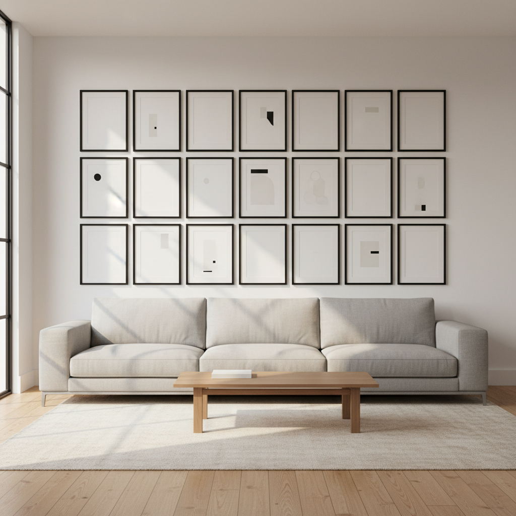
Identical frames, evenly spaced, in a perfect rows-and-columns arrangement. It's the layout most associated with a genuinely designed, almost architectural feel, and it's also one of the least forgiving of any small measuring error.
The grid is the gallery wall at its most deliberate. Every frame is the same size, every gap is identical, and the whole composition reads as a single unified piece rather than a collection of individual frames. This is the layout that works best when the art itself is part of a series, a set of botanical prints, black-and-white photography, or abstract pieces that were designed to be viewed together. The uniformity of the frame grid lets the art itself become the focal point, rather than the arrangement competing for attention. But precision is non-negotiable here. A quarter-inch error on one frame in a grid is visible from across the room because the eye expects perfect alignment and immediately registers any deviation from it.
- Choose identical or near-identical frame sizes, this layout depends on uniformity.
- Decide your grid dimensions (3x3, 2x4) based on available wall space and frame count.
- Measure and mark consistent spacing, typically 2 to 3 inches between frames, using a level and tape measure, not visual estimation.
- Hang your top row first, using it as the reference line for every row beneath it.
- Double-check horizontal and vertical alignment after every single frame, not just at the end.
- Reads as highly intentional and architectural
- Works especially well with a matched frame or print series
- Simple to plan since spacing is mathematically consistent
Search terms: "matching frame set multipack," "picture hanging level tool," "gallery wall spacing template"
The Salon-Style Cluster

A homeowner shared that she'd always assumed a wall covered in mismatched frame sizes and styles simply looked cluttered by definition, until she saw a genuinely gorgeous salon-style cluster and realized the "mess" was actually a carefully planned asymmetry.
The salon-style cluster is the gallery wall at its most expressive and personal. It's the layout that says "these pieces were collected over a lifetime," even if they were actually sourced in a single weekend. The key distinction between a salon cluster and a random scattering is that the cluster has a defined outer boundary, an invisible shape that contains all the frames within it, and internal balance, meaning the visual weight is distributed across the composition rather than concentrated on one side. When done well, the eye moves across the cluster in a natural rhythm, landing on different pieces at different moments. When done poorly, it looks like someone threw frames at the wall and hung them where they landed.
- Lay every frame out on the floor first, arranging and rearranging until the composition feels balanced before a single nail goes in the wall.
- Distribute frame sizes and orientations evenly across the cluster, don't group all your largest pieces on one side.
- Vary spacing intentionally, tighter in some spots, slightly looser in others, rather than perfectly uniform gaps.
- Trace your final floor layout onto craft paper, then tape the paper templates to the wall to confirm placement before hanging anything.
- Hang from the visual center outward, working toward the edges rather than starting from one corner.
- Accommodates mismatched frames and sizes beautifully
- Feels collected over time rather than bought as a set
- Genuinely forgiving of imperfect spacing, unlike a grid
Search terms: "craft paper roll," "assorted vintage frames," "picture hanging kit variety pack"
The Horizontal Line-Up

A single row of frames, all centers aligned at the same height, running the width of a hallway or above a long piece of furniture. Simple, calm, and one of the easiest layouts to get genuinely right on a first attempt.
This layout is the gallery wall equivalent of a well-pressed shirt: understated, clean, and quietly confident. It doesn't demand attention the way a salon cluster or a dramatic staircase ascent does, but it anchors a long wall or a piece of furniture with a sense of order that's immediately calming. The horizontal line-up is also one of the most versatile layouts because it works above nearly any long horizontal surface: a sofa, a console table, a dining sideboard, or along an empty hallway. The challenge is less about the frames themselves and more about maintaining a perfectly level line across a span that may be eight, ten, or even fifteen feet long.
- Mark a single horizontal guideline at your intended center height, typically 57 to 60 inches from the floor for eye-level viewing.
- Measure each frame's own center point (halfway between its top and bottom edge).
- Align every frame's center point to the same horizontal guideline, regardless of frame height variation.
- Space frames evenly, using consistent gaps measured with a tape measure rather than estimated by eye.
- Use a long level across the full row before finalizing, small errors compound visibly over a long horizontal run.
- Simple, calm, and highly effective for hallways or long walls
- Easy to execute correctly on a first attempt
- Works well above furniture like consoles or long sofas
Search terms: "long level tool," "picture hanging center marker," "hallway frame set"
The Staircase Ascent
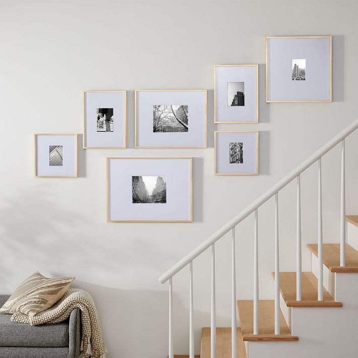
Imagine a reader with a stairwell wall she'd left completely bare for years, uncertain how to hang anything along an angled sightline. A staircase-ascending frame layout, following the same angle as the stairs themselves, finally gave that wall a genuine purpose.
Staircase walls are the most underutilized vertical space in most homes, and they're also one of the most dramatic locations for a gallery wall when done correctly. The stair angle itself provides the layout's structure, so the frames aren't fighting the architecture, they're echoing it. This creates a natural sense of upward movement that draws the eye along the stairs in the same direction you physically travel. The biggest design decision is whether to use uniform frames for a clean, simple ascent, or graduated sizes that grow larger as they climb, which adds a sense of progression and visual momentum.
- Measure the rise and run of your staircase to determine the angle the frame line should follow.
- Choose either uniform frame sizes for a clean, simple ascent, or graduated sizes (smaller at the bottom, larger at the top) for more visual interest.
- Mark consistent spacing between each frame's center point, following the stair's angle rather than a flat horizontal line.
- Hang starting from the bottom of the staircase upward, checking the angle against the actual stair line every two or three frames.
- Step back and view from both the top and bottom of the stairs, the layout needs to work from both vantage points.
- Uses a genuinely awkward wall space that often stays bare
- Works with the room's architecture rather than against it
- Creates a dynamic, upward visual movement
Search terms: "staircase gallery wall frame set," "small uniform picture frames," "stairwell wall decor"
The Anchor-and-Orbit Layout
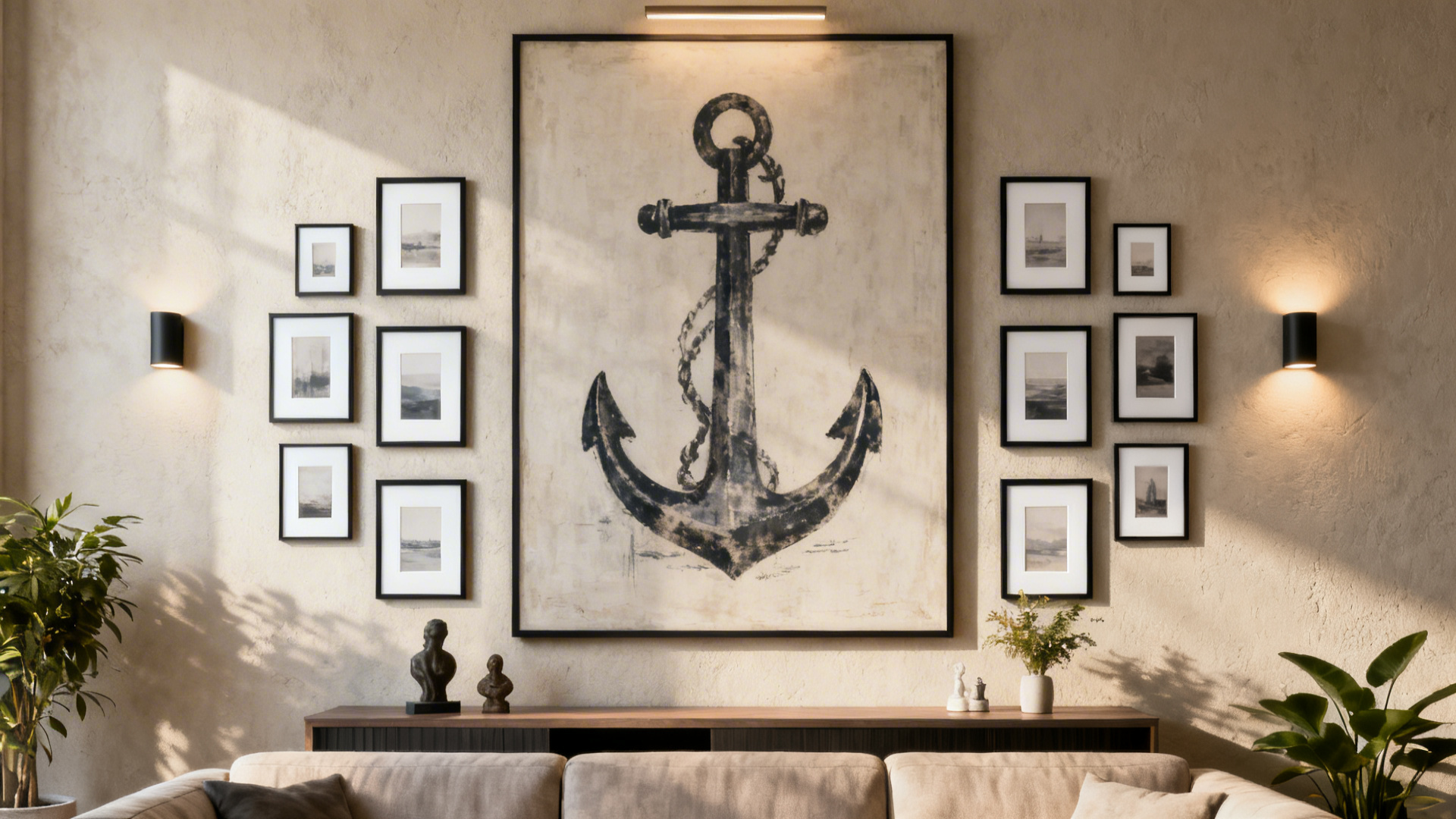
One large central piece, surrounded by smaller frames radiating outward around it, similar to a solar system. This layout gives a gallery wall a clear focal point while still incorporating several smaller pieces.
This layout solves a specific problem: what to do when you own one piece of art you genuinely love, and several smaller pieces that are nice but don't command the same presence. Rather than trying to make the smaller pieces compete with the large one, the anchor-and-orbit approach lets the large piece be the undeniable star while the smaller frames play a supporting role. The result is a composition that has hierarchy, which is the single quality most amateur gallery walls lack. Without hierarchy, every frame reads as equally important, and the eye doesn't know where to land. With a clear anchor, the composition has a starting point, and the surrounding frames become a journey outward from it.
- Choose one genuinely large anchor piece, ideally at least double the size of your smaller surrounding frames.
- Position the anchor at the composition's visual center, slightly above true center often reads best at eye level.
- Arrange smaller frames around it in a loose, organic radius rather than a perfect geometric circle.
- Keep spacing between the anchor and surrounding frames slightly larger than the spacing between the smaller frames themselves.
- Lay the full composition on the floor first to confirm the radius feels balanced before hanging.
- Creates an unmistakable focal point immediately
- Balances one statement piece with several smaller ones
- Works well when you own one piece you love more than the rest
Search terms: "large statement wall art," "small picture frames assorted," "oversized framed print"
The Symmetrical Mirror Layout
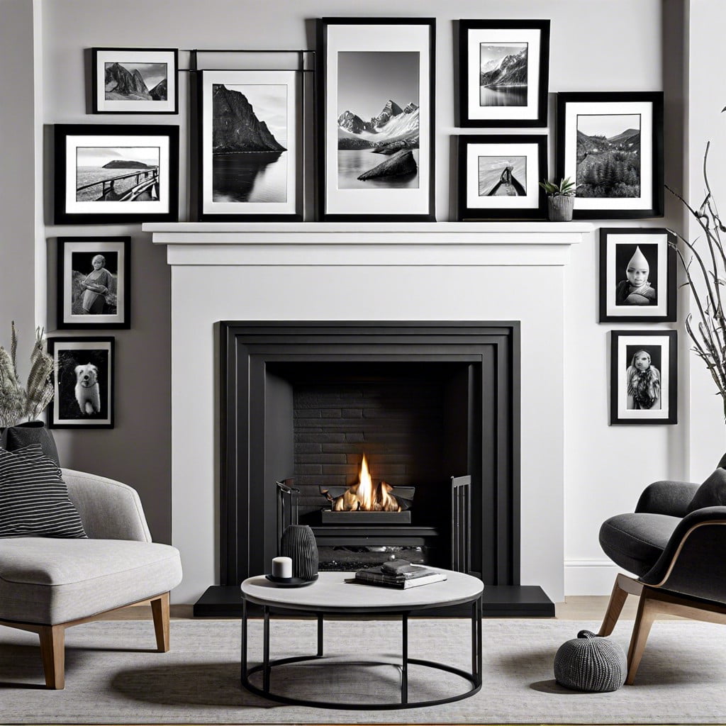
A homeowner shared that flanking her fireplace with two perfectly mirrored frame clusters, identical arrangement on each side, gave her living room a formal, considered calm that no single asymmetrical layout had achieved for that particular spot.
Symmetry is one of the oldest design principles in architecture, and for good reason: the human brain finds it deeply satisfying. A mirrored gallery wall takes that principle and applies it to a collection of frames. This layout works especially well in rooms that already have a strong central axis, a fireplace, a large window, a prominent piece of furniture, because the frames reinforce the architecture rather than competing with it. The challenge is execution: a layout that's meant to be perfectly symmetrical but is off by even half an inch reads as a mistake, while genuine asymmetry in a salon cluster reads as intentional. Precision is the price of admission for this particular formula.
- Choose a central architectural feature, a fireplace, a window, a doorway, to mirror the layout around.
- Design one side's frame cluster fully first, using identical frames and spacing measurements for the opposite side.
- Measure the exact distance from your central feature to each frame on the first side, then replicate those exact measurements in reverse on the second side.
- Use a level and consistent measuring throughout, this layout depends entirely on precision to look correct.
- Step back and view straight-on from a distance, minor asymmetries are most visible from a centered vantage point.
- Creates a formal, calm, balanced feel around a focal architectural feature
- Particularly effective flanking fireplaces or large windows
- Reads as deliberate and high-end when executed precisely
Search terms: "matching frame pair set," "symmetrical wall decor frames," "fireplace flanking wall art"
The Single-Row Eye-Level Line

Not to be confused with the horizontal line-up (Layout 3), this variation uses a single row of small, uniform frames placed at a precise, deliberately low eye-level height, common in more minimalist or Scandinavian-influenced interiors.
Where the horizontal line-up is confident and architectural, the single-row eye-level line is intimate and restrained. It's the gallery wall stripped down to its quietest form: a few small pieces, generous spacing, and a height that feels personal rather than public. This layout is particularly effective in spaces meant for relaxation, above a low sofa, along a bedroom wall, in a reading nook, because the lower height invites you to sit and look closely rather than stand back and admire from across the room. The restraint is the statement here: the empty wall around the frames is as much a part of the composition as the frames themselves.
- Choose small, uniform, minimal frames, ideally with thin, understated borders rather than ornate styles.
- Set your guideline noticeably lower than standard eye-level height, closer to seated eye level if the wall is above a sofa or bench.
- Space frames with generous gaps between each one, this layout relies on breathing room, not density.
- Keep the row perfectly level using a long level tool across the entire span.
- Resist adding a second row, the entire minimalist effect depends on restraint to a single line.
- Fits minimalist and Scandinavian-style interiors particularly well
- Creates an intimate, calm feeling rather than a bold statement
- Genuinely simple to execute with basic measuring tools
Search terms: "thin border minimalist frames," "small uniform art frames," "Scandinavian style picture frame"
The Mixed-Media Cluster

Imagine a reader who wanted a gallery wall reflecting her actual interests, not just framed prints, and incorporated a small mirror, a woven wall hanging, and a shelf alongside traditional frames into one cohesive cluster.
This layout breaks the single biggest unspoken rule of gallery walls, that every piece must be flat and framed, and in doing so, it often creates the most personal and interesting compositions of any formula on this list. A mixed-media cluster can include framed art, yes, but also a small round mirror, a miniature floating shelf with a tiny object on it, a woven textile, a ceramic plate, or a small sculptural piece. The challenge is cohesion: with so many different materials, depths, and textures, the layout needs a strong unifying element to avoid reading as a random collection. That unifying element is almost always a consistent color palette or a shared tone across every piece, regardless of its medium.
- Choose one unifying element across all pieces, a consistent color palette or frame tone, even as the media types vary.
- Treat non-frame objects (a mirror, a small shelf) as you would a larger anchor piece, giving it appropriate visual weight in the layout.
- Lay the full mixed composition on the floor first, exactly as with the salon-style cluster, since varied depths and shapes are harder to judge once on the wall.
- Account for actual physical depth, a small shelf or woven hanging often projects further from the wall than a flat frame, plan spacing accordingly.
- Balance flat and dimensional pieces throughout the cluster rather than grouping all the flat frames together and all the dimensional pieces elsewhere.
- Reflects personal interests beyond just framed prints
- Adds genuine physical dimension and texture to a flat wall
- Feels distinctly personal and collected, not store-bought as a set
Search terms: "small decorative mirror wall," "small wall shelf floating," "woven wall hanging small"
The Vertical Column

A single stacked column of frames, one directly above another, works especially well in narrow wall spaces, beside a doorway, in a hallway nook, where a wider layout simply wouldn't fit.
This is the gallery wall solution for spaces that other layouts can't accommodate. Between a doorframe and a corner. Along a slim hallway wall. Beside a tall window. These narrow vertical strips of wall are often left completely bare because a horizontal or clustered layout won't fit, but a vertical column turns that limitation into a feature. The column draws the eye upward, emphasizing ceiling height and creating a sense of verticality that can actually make the whole room feel taller. A column that extends from near the floor to near the ceiling feels architectural, like it was part of the room's design from the beginning, rather than a compromise forced by limited wall width.
- Measure your narrow wall space's exact width to confirm frame size will fit with reasonable margin on either side.
- Choose frames of consistent width, even if their heights vary slightly, for a clean vertical line.
- Mark a single vertical centerline down the middle of your available space using a level.
- Space frames evenly along that centerline, working from a comfortable eye-level frame outward, both up and down.
- Keep the column's total height proportional to the wall, a column reaching from near the floor to near the ceiling can feel more dramatic and intentional than a short, isolated stack.
- Solves narrow wall spaces other layouts can't fit
- Creates a strong vertical line drawing the eye upward
- Works well with a themed or sequential set of prints
Search terms: "narrow tall picture frames," "vertical gallery wall frame set," "hallway nook wall decor"
Planning Your Layout Before a Single Nail
Regardless of which formula above you choose, the single habit that separates a genuinely curated-looking gallery wall from a cluttered one is planning fully before any hardware touches the wall. Trace every frame onto craft paper and tape the paper templates directly to the wall in your intended arrangement first. This step, which costs nothing but an hour of time, is the single most reliable predictor of whether a gallery wall will look intentional or accidental. Live with the paper version for at least a day or two, walking past it at different times and lighting to confirm the composition actually feels right. Check it in morning light, evening lamp light, and from the doorway where you first enter the room. Only once the paper layout is fully confirmed should the actual frames, and any nail holes, follow.
For renters or anyone hesitant about committing to nail holes, this paper-planning step is doubly important. It also gives you a chance to test whether removable adhesive strips or hooks can support your frame weights before committing to a permanent installation method. Mark each paper template with the actual weight of the frame it represents, and test your chosen hanging hardware on a single frame before hanging the entire composition.
Spacing and Frame-Mixing Rules
These are the guidelines professional designers and experienced installers return to across nearly every project, regardless of which specific layout formula is being used:
- Standard spacing: 2 to 3 inches between frames works as a reliable default across most of the layouts above. Tighter than 1.5 inches starts to feel cramped; wider than 4 inches can feel disconnected unless the layout specifically calls for generous breathing room.
- Mixing frame finishes: limit yourself to two finishes maximum (for example, black and natural wood, or gold and white) across one wall. More than two finishes starts to look unplanned, while one finish alone can feel overly matched unless it's a grid layout where uniformity is the point.
- Mixing frame styles: a shared color palette in the art itself unifies mismatched frame styles more reliably than trying to match the frames themselves. If your frames are varied, let the art inside them do the unifying work through consistent tones or subject matter.
- Eye-level height: center the overall composition around 57 to 60 inches from the floor for a viewing-height that works for most standing adults. For compositions above furniture, measure from the furniture surface upward rather than from the floor.
- Weight distribution: place your visually heaviest pieces (darkest frames, largest sizes, boldest art) toward the lower portion of the composition and lighter pieces toward the top. This creates a grounded, stable feeling rather than a top-heavy one.
The Full Cost Comparison
These ranges reflect typical new retail pricing; thrifted, secondhand, or printable art approaches can reduce each layout's cost significantly:
| Layout | Typical Frame Count | Budget Range | Investment Range |
|---|---|---|---|
| Grid layout | 6–9 frames | $60–120 | $150–300 |
| Salon-style cluster | 8–15+ frames | $80–180 | $200–500 |
| Horizontal line-up | 3–6 frames | $40–100 | $100–250 |
| Staircase ascent | 5–8 frames | $50–130 | $130–300 |
| Anchor-and-orbit | 1 large + 4–8 small | $70–160 | $180–400 |
| Symmetrical mirror | 4–10 frames (matched pairs) | $60–150 | $150–350 |
| Single-row eye-level | 3–5 frames | $30–80 | $80–180 |
| Mixed-media cluster | 6–12 pieces (varied) | $50–150 | $150–400 |
| Vertical column | 3–5 frames | $35–90 | $90–200 |
The budget range assumes basic frames and printable or affordable art. The investment range assumes higher-quality frames, custom matting, or original artwork. Most successful gallery walls land somewhere in between, and the layout formula itself, not the price of the frames, is what determines whether the final result looks curated or cluttered.
Common Questions
Which layout is most forgiving for a first-time attempt? The salon-style cluster and horizontal line-up are both genuinely forgiving of small imperfections; the grid and symmetrical mirror layouts demand the most precision and benefit from experience or at least a very patient measuring session.
Can I combine two layout formulas on one large wall? Yes, a large wall can reasonably support a horizontal line-up above a console paired with a small vertical column beside a doorway. Treat them as related but distinct compositions with their own internal spacing rules, rather than blending them into one oversized cluster.
How do I know if my wall is big enough for a gallery wall at all? Nearly any wall works with the right formula scaled to it. A narrow space calls for a vertical column, not a wide grid. A long hallway suits a horizontal line-up. Match the formula to the space rather than forcing a layout that doesn't fit the wall's actual proportions.
What's the single biggest reason gallery walls end up looking cluttered instead of curated? Skipping the floor-and-paper planning step and hanging frames as they're acquired over time, rather than as one considered composition planned and executed together.
How do I handle a gallery wall as a renter who can't make nail holes? Removable adhesive picture-hanging strips rated for your frames' actual weight are the most common solution. Test one frame first, wait the full cure time, and confirm it holds before committing the entire wall. For heavier pieces, consider leaning a large anchor frame on a console table or mantel and building the gallery wall around that, reducing the number of pieces that actually need wall attachment.
A gallery wall was never really about the individual frames at all. Every layout here proves the same point: the formula holding the pieces together is what separates curated from cluttered, not the specific art inside each frame, not the price of the frames, not even the room they hang in.
The nine formulas above are scaffolding. They give your collection, however modest or mismatched, a structure that reads as intentional before anyone even registers what the individual pieces are. That structure is what transforms a wall of frames into a gallery wall, and it costs nothing to learn.
Start with the planning step this weekend, tracing your frames onto paper before a single nail goes in, and let that one habit carry the whole composition from scattered to stunning.
Shop the Story
- matching frame set multipack
- picture hanging level tool
- craft paper roll
- assorted vintage frames
- large statement wall art
- small decorative mirror wall
- thin border minimalist frames
- narrow tall picture frames
- picture hanging kit variety pack
- small wall shelf floating