
9 Paint Colors Designers Never Use (And What They Pick Instead)
The paint colors designers quietly avoid, and the alternatives they choose instead
I once spent an entire weekend repainting my living room the exact gray I'd seen in a dozen beautiful before-and-after photos online, confident I'd finally found "the" neutral. By Sunday evening, under my own lighting, in my own furniture, it looked flat, slightly cold, and somehow less finished than the plain white it replaced.
A friend who'd trained in design walked in a week later, glanced at the wall, and asked, almost offhand, "Did you check the undertone before you bought it?" I hadn't. I didn't even fully understand what that meant yet. That question sent me down a genuinely useful rabbit hole, not about which specific colors are "good" or "bad," but about which colors designers quietly steer clients away from again and again, and why.
A quick note before we start: a few of the stories ahead are shared as told to me directly, and a few are offered as illustrative examples to make a principle easier to picture, I've tried to be clear about which is which rather than presenting every anecdote as independently verified. Paint colors and their exact names vary somewhat between brands, so throughout this piece I'm describing the specific tone and undertone to look for rather than one universal product name, since the same "color" can shift meaningfully between manufacturers.
Here are nine colors and color categories designers tend to avoid, the specific reasons why, and exactly what most reach for instead.
Table of Contents
- Stark Builder-Grade White
- Cool, Blue-Undertoned Gray
- Bright Primary Red as an Accent Wall
- Trendy Saturated Pink
- Pure, Flat Black
- Cool Spa Blue
- Bright, Saturated Yellow
- Yellow-Toned 1990s Beige
- High-Gloss White Trim
- Understanding Undertones: The Skill Behind Every Choice Above
- How to Actually Test a Paint Color Before Committing
- A Room-by-Room Color Application Guide
- Common Paint Color Mistakes Beyond the Color Itself
- The Full Cost Comparison
- Common Questions
Stark Builder-Grade White
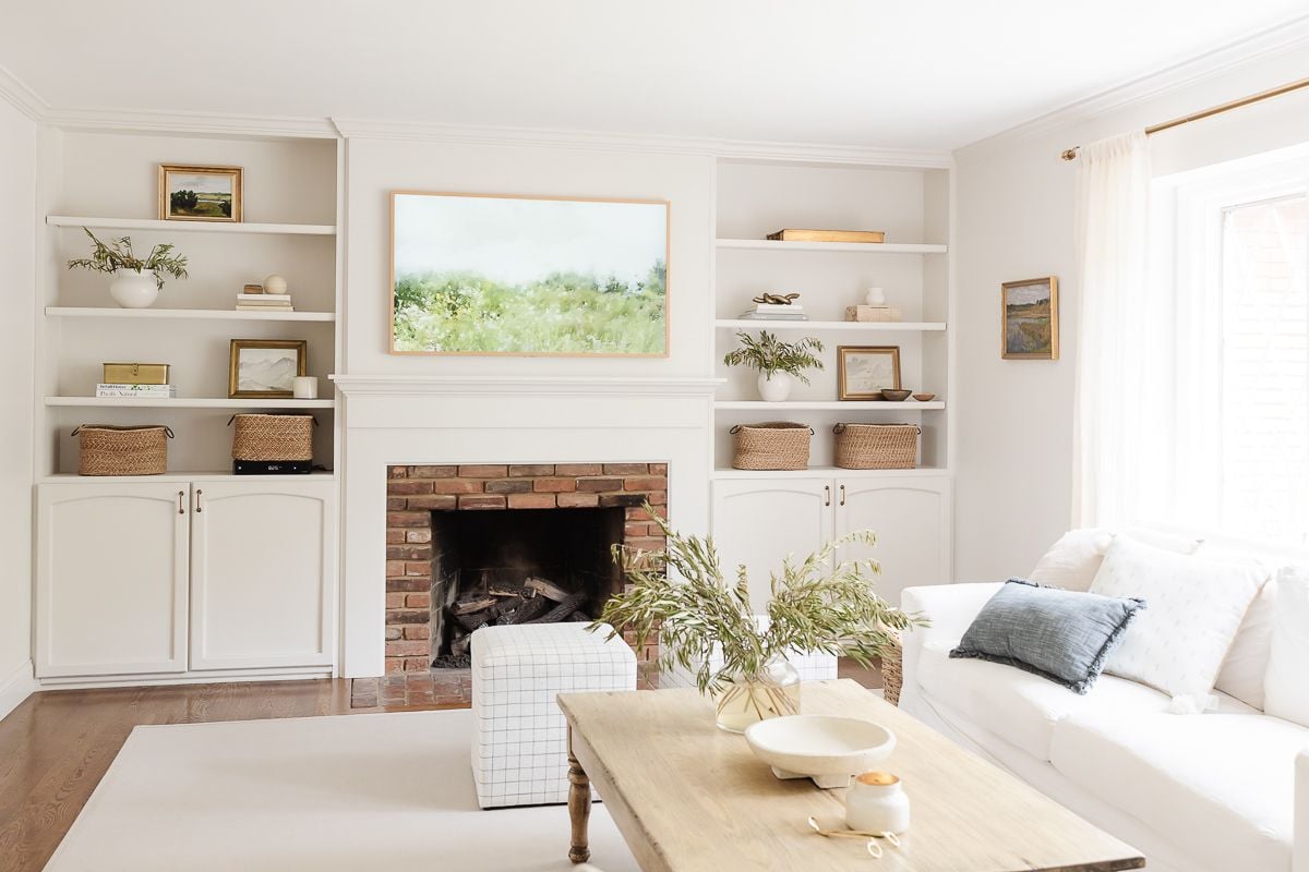
The white that comes standard in most rental apartments and new construction is chosen for one reason, it hides construction marks and photographs neutrally in real estate listings. It was never chosen because it's flattering to actually live inside.
- Look specifically for whites described as "warm white" or "soft white" rather than "bright white" or "pure white" on the paint chip.
- Check the undertone by holding the swatch against a plain white sheet of paper, most builder whites will look faintly blue or gray by comparison; warmer whites will look faintly cream or beige.
- Test a sample patch in your actual room across a full day, morning, midday, and evening light all shift how a white reads.
- Choose a slightly warmer version than feels necessary on the chip itself, white intensifies its undertone once it covers a full wall.
- Pair with warm-toned trim in a similar family rather than a stark, contrasting bright white trim, discussed further in Idea 9.
- Works beautifully in rooms with abundant natural light, letting warmth balance the brightness
- Pairs especially well with warm wood tones, brass hardware, and natural fiber textiles
- A strong default for ceilings throughout a home, keeping the "fifth wall" from reading as sterile
- Reads as warm and inviting rather than clinical
- Flatters skin tones and wood finishes far better than a cool white
- Still functions as a genuinely neutral, flexible base color
Search terms: "warm white interior paint," "soft white paint sample," "cream white wall paint"
Cool, Blue-Undertoned Gray

A homeowner shared that she'd chosen the exact gray from a widely shared before-and-after photo online, only to discover her own room took on a faintly cold, almost blue cast she hadn't noticed in the original photo at all, likely shot in different lighting than her own home.
- Look for grays specifically described as "greige," a blend of gray and beige, rather than a pure, cool gray.
- Check the undertone in both natural daylight and your evening artificial lighting, cool grays often shift more dramatically between the two than warmer options.
- Test against your existing flooring specifically, cool grays can clash noticeably with warm wood floors in a way that's hard to predict from a paint chip alone.
- Compare two or three greige options side by side rather than committing to the first one that looks reasonable.
- Paint a large enough sample patch, at least two feet square, small chips are notoriously unreliable predictors of how a color reads at full-wall scale.
- Particularly effective in rooms with warm wood flooring or furniture
- Works well as a whole-home neutral that transitions smoothly room to room
- Pairs beautifully with both black and brass hardware finishes
- Reads as sophisticated without the coldness of a blue-based gray
- Transitions well between rooms with different lighting conditions
- Complements a wider range of furniture and flooring tones
Search terms: "warm greige paint," "peel and stick paint sample," "greige paint swatch"
Bright Primary Red as an Accent Wall
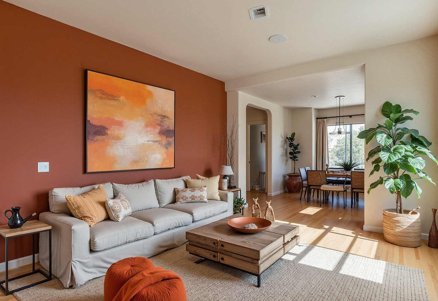
Imagine a reader who painted a single accent wall a bold, true red, inspired by a striking photo she'd seen online, and found herself repainting it a more muted tone within a year, not because red itself was wrong, but because that specific saturation felt increasingly loud in daily life rather than in a single photograph.
- Look for red-family colors described as brick, terracotta, or rust rather than "true red" or "fire engine red."
- Check the color's saturation level specifically, muted, earthier reds maintain warmth and depth without the visual intensity of a fully saturated primary.
- Sample the color in the specific room and lighting where it will actually live, not just against a bright, well-lit paint display.
- Consider the room's actual function, a muted brick tone works well in dining rooms and entryways where a bold statement is welcome without overwhelming daily relaxation spaces.
- Pair with warm neutrals elsewhere in the room to let the accent tone feel grounded rather than isolated.
- Dining rooms, where a warm, grounding tone supports gathering and conversation
- Entryways, making a confident first impression without overwhelming the whole home
- Paired with warm wood tones, brass fixtures, and cream textiles
- Maintains warmth and richness without visual fatigue over time
- Ages more gracefully as trends and personal taste shift
- Pairs more flexibly with a wider range of other colors and materials
Search terms: "terracotta paint color," "brick red interior paint," "muted rust wall paint"
Trendy Saturated Pink

A homeowner shared that a bright, specific shade of pink, closely tied to a very recognizable design trend of a particular era, felt fresh and exciting when she painted it, and unmistakably dated within just a couple of years, in a way that a softer, more muted version of the same color family never would have.
- Look for pink-family colors described as dusty, muted, or blush rather than "bubblegum" or "hot pink."
- Check that the color reads as a warm neutral from a slight distance, rather than an obviously "pink" statement up close.
- Sample against your existing furniture and flooring, muted rose tones generally integrate more smoothly with a wider range of existing decor than a saturated version would.
- Consider this tone specifically for bedrooms or reading nooks, where its softness supports rest rather than competing with a room's other functions.
- Pair with warm wood, brass, and cream tones to keep the overall palette feeling sophisticated rather than overtly "pink."
- Bedrooms, where a soft, muted tone supports rest and calm
- Powder rooms, where a confident but not overwhelming color choice works well
- Paired with warm brass fixtures and natural linen textiles
- Avoids the fast-dating quality of trend-specific saturated colors
- Reads as sophisticated rather than overtly trend-driven
- Integrates more smoothly with a broader range of existing decor
Search terms: "dusty rose paint color," "muted blush wall paint," "warm pink neutral paint"
Pure, Flat Black
One homeowner shared that a genuinely pure black accent wall, chosen for a dramatic, moody effect, felt more like a void than a considered design choice once the paint fully dried and cured, flat and light-absorbing in a way that read as unfinished rather than intentional.
- Look for colors described as deep charcoal, espresso, or near-black rather than "true black" or "jet black."
- Check for a subtle undertone, a faint warmth (brown-black) or coolness (blue-black) adds dimension that pure black lacks.
- Sample in your specific room's lighting, near-black tones can shift dramatically between warm lamp light and cooler daylight.
- Consider a satin or eggshell finish rather than fully flat/matte, a slight sheen helps a very dark color catch and reflect light rather than absorbing it entirely.
- Use in smaller doses first, a single wall, a door, cabinetry, before committing to a full room in a genuinely dark tone.
- Home offices and libraries, supporting a moody, focused atmosphere
- Cabinetry and trim, adding drama without overwhelming an entire room
- Paired with warm brass hardware and natural wood tones for contrast
- Retains visual depth and dimension pure black often lacks
- Reads as intentional and sophisticated rather than flat
- Slightly more forgiving of scuffs and imperfections than true black
Search terms: "deep charcoal paint," "near black warm paint," "espresso brown wall paint"
Cool Spa Blue
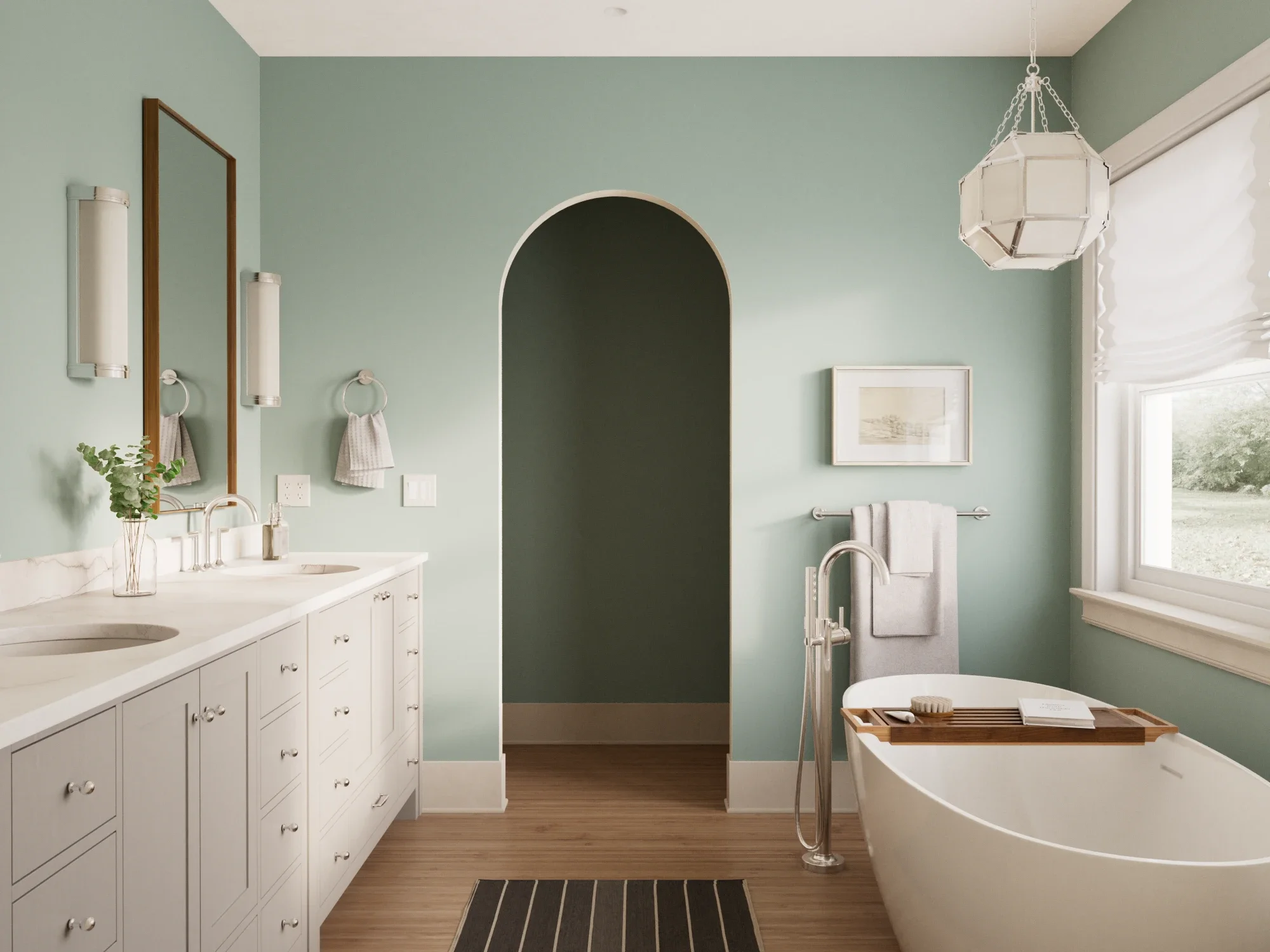
Imagine a reader who chose a pale, cool spa blue for her bathroom expecting a calming, serene effect, and instead found the room felt cold and clinical, particularly on overcast days when natural light was limited.
- Look for colors described as sage, muted blue-green, or "greenish blue" rather than pure, icy blue.
- Check the room's actual natural light conditions before committing, north-facing rooms in particular tend to amplify a cool color's coldness.
- Sample against any existing tile, fixtures, or hardware in the room, a mismatch between wall color and fixed finishes is considerably harder to fix than the wall alone.
- Consider pairing with warm wood accents or brass fixtures specifically to offset the cooler elements of a blue-green tone.
- Test the color at different times of day, this category shifts more dramatically between morning and evening light than most neutrals.
- Bathrooms, retaining a calming quality without the coldness of a pure blue
- Bedrooms, supporting rest with a warmer, more grounded version of blue
- Paired with natural wood, woven textures, and warm white trim
- Maintains a calming quality without reading as sterile
- Performs more consistently across varied natural light conditions
- Pairs naturally with warm materials most homes already include
Search terms: "sage green paint," "muted blue green paint," "warm bathroom paint color"
Bright, Saturated Yellow
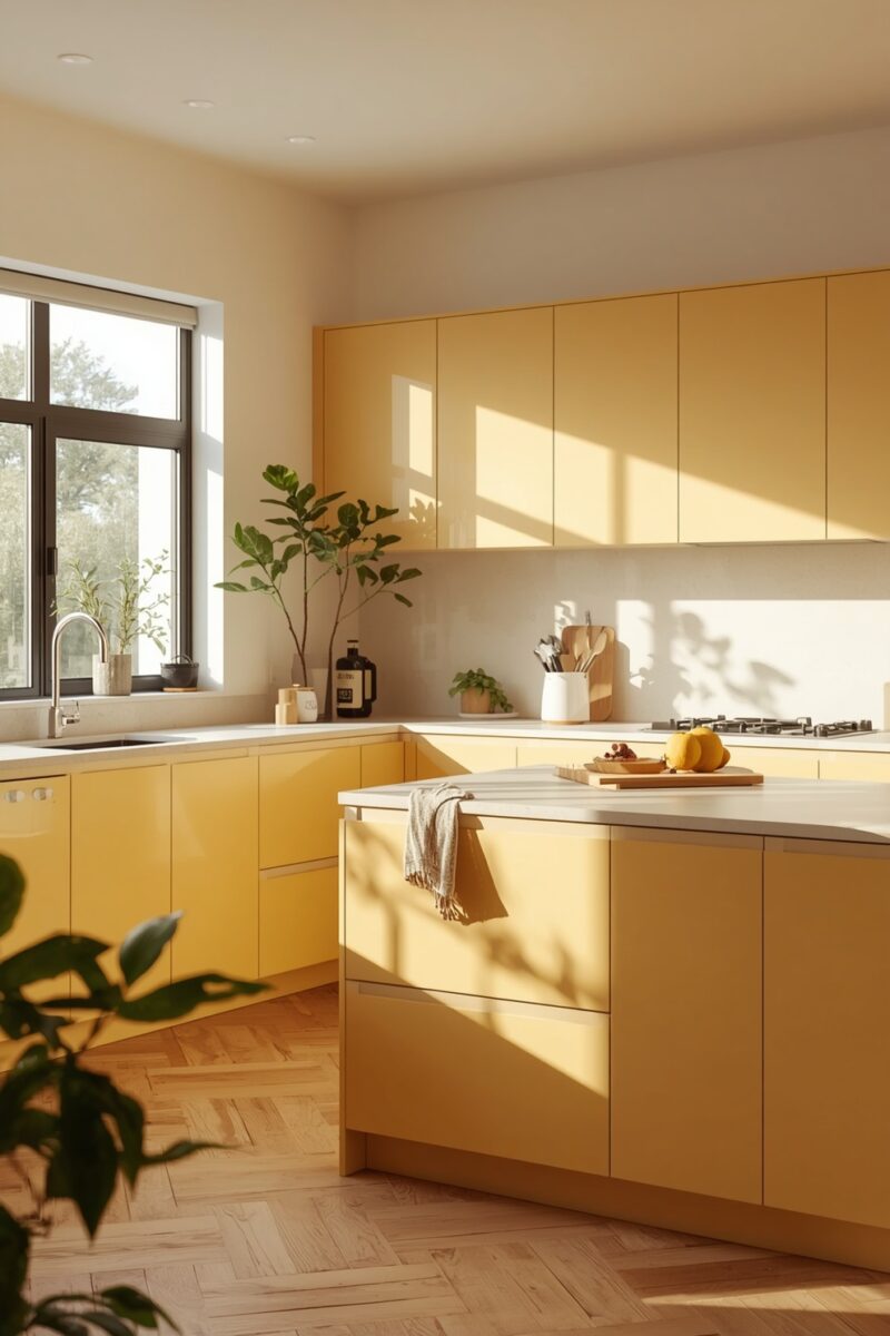
A homeowner shared that a cheerful, bright yellow kitchen felt energizing for the first few months, then increasingly difficult to actually relax in, the intensity that initially read as "cheerful" gradually reading as simply loud during quiet, everyday moments in the space.
- Look for colors described as butter, warm ochre, or muted gold rather than "sunshine yellow" or "lemon."
- Check the saturation level specifically, a muted, earthier yellow retains warmth without the intensity of a fully saturated version.
- Sample in the room's actual lighting across a full day, yellow in particular can shift dramatically and unpredictably between warm and cool lighting.
- Consider using the muted tone on a single wall or in smaller doses (cabinetry, an accent) rather than a full room if uncertain.
- Pair with warm neutrals and natural wood to ground the color rather than letting it dominate entirely.
- Kitchens, retaining warmth and energy without overwhelming daily use
- Entryways, offering a welcoming first impression in smaller doses
- Paired with warm wood tones, cream, and brass or black hardware
- Maintains warmth without the visual fatigue of full saturation
- Ages more gracefully as personal taste shifts over years
- Easier to pair with a broader range of existing materials
Search terms: "warm butter yellow paint," "muted ochre paint color," "warm gold wall paint"
Yellow-Toned 1990s Beige

Imagine a reader who inherited a home with the exact yellow-toned beige common throughout the 1990s and early 2000s, and found that even after updating furniture and decor around it, the walls themselves kept the whole space feeling dated in a way nothing else quite explained.
- Compare your current beige directly against a warm greige swatch, the difference in yellow intensity is usually immediately visible side by side.
- Look specifically for greige options balanced between beige and gray, avoiding both the dated yellow-heavy beige and the cold blue-gray from Idea 2.
- Test in your room's actual lighting across a full day before committing, since this undertone shift is often subtle enough to miss on a small chip alone.
- Consider that trim and ceiling color may need updating alongside the walls, a dated beige is often paired with equally dated trim choices.
- Prime over strong existing beige if it's particularly saturated, preventing the old color from subtly influencing your new one once dry.
- Whole-home neutrals, providing a cohesive, updated base throughout
- Living rooms and bedrooms, supporting a wide range of furniture styles
- Paired with both black and brass hardware equally well
- Feels current rather than tied to a specific past design era
- Balances warmth and cool tones more evenly than a yellow-heavy beige
- Pairs more flexibly with updated furniture and fixture choices
Search terms: "warm greige paint," "color blocking primer," "updated neutral wall paint"
High-Gloss White Trim

A homeowner shared that after finally choosing a warm, considered wall color, her trim's original high-gloss stark white finish suddenly stood out as the one remaining element still reading as clinical and slightly dated by comparison, an easy detail to overlook until everything else around it had changed.
- Choose a matte or eggshell finish rather than high-gloss or semi-gloss for a softer, less clinical reflection of light.
- Match the trim's undertone to your wall color's family, a warm wall paired with cool-toned trim creates the same clash discussed throughout this list.
- Consider a soft warm white rather than the same stark white commonly used for walls historically, per Idea 1.
- Test trim paint on an actual door or window frame section, not just a wall sample, trim's smaller surface area and different lighting angle can shift how a color reads.
- Factor in durability, trim experiences more wear than walls, so a slightly higher-durability matte or eggshell formulation is often worth the modest extra cost.
- Any room where wall color has already been warmed up, completing the overall palette shift
- Historic or traditional homes, where a softer trim finish feels more period-appropriate
- Paired with warm wall colors from any of the previous eight ideas
- Completes a room's overall warmth rather than leaving one clashing element
- Reads as more current and considered than traditional high-gloss white
- Modern formulations close most of the old durability gap
Search terms: "washable eggshell trim paint," "soft white trim paint," "warm white door paint"
Understanding Undertones: The Skill Behind Every Choice Above
Every single swap on this list comes down to one underlying skill: recognizing undertone, the subtle secondary color hiding within what looks like a simple, single-tone paint chip. Nearly every "neutral" color, white, gray, beige, carries a faint undertone of another color entirely, warm undertones lean yellow, orange, or red; cool undertones lean blue, green, or purple. A wall that looks "just white" or "just gray" on a small chip often reveals a distinct, sometimes surprising undertone once it covers an entire wall and interacts with your room's specific lighting, flooring, and furniture. Professional designers train themselves to spot this undertone before a client ever sees a full wall painted, checking a chip against a plain white sheet of paper, viewing it in multiple lighting conditions, and considering how it will interact with fixed elements in the room that can't easily be changed, flooring, tile, cabinetry. This single skill, more than any specific color name or trend, is what separates a choice that photographs well in a single moment from one that genuinely holds up living with it daily for years.
How to Actually Test a Paint Color Before Committing
Regardless of which color from this list you're drawn to, the same testing process applies across all nine. Buy a genuine sample, not just a paint chip, and paint a section at least two feet square directly on your actual wall, not a separate poster board, wall surfaces reflect and absorb light differently than smooth board. View the sample across a full day, morning, midday, and evening, and under both natural and your actual artificial lighting, since a color's undertone can shift meaningfully between these conditions. Hold a plain white sheet of paper directly against the sample to reveal any hidden undertone more clearly than viewing it alone. Live with the sample for at least three to five days before making a final decision, initial excitement or hesitation about a color often shifts once it's been seen repeatedly in ordinary, unremarkable moments, not just the first dramatic reveal.
A Room-by-Room Color Application Guide
- Living rooms: warm greige or warm white as a base, with a muted brick or terracotta accent wall if a bolder statement is wanted.
- Bedrooms: muted dusty rose, warm sage, or a soft warm white, all support the calm, restful quality this room needs most.
- Kitchens: warm white or butter-toned yellow in smaller doses, paired with warm greige for larger wall expanses.
- Bathrooms: warm sage or muted blue-green rather than a cold spa blue, especially in rooms without abundant natural light.
- Home offices: deep charcoal or near-black warm brown on one wall supports focus without the flatness of true black.
- Trim throughout the home: soft matte or eggshell warm white, consistently, to tie every room's palette together.
Common Paint Color Mistakes Beyond the Color Itself
- Choosing a color from a photo taken in different lighting: the single most common source of disappointment once painted at home.
- Testing only on a small chip, never a full wall sample: chips are notoriously unreliable predictors of how a color reads at scale.
- Ignoring existing fixed elements: flooring, tile, and cabinetry that can't easily change should guide wall color choice, not the reverse.
- Mismatching wall and trim undertones: a warm wall paired with cool trim (or vice versa) undermines an otherwise well-chosen palette.
- Rushing the decision: committing to a full room without living with a sample for several days across varied lighting conditions first.
The Full Cost Comparison
| Item | Typical Cost |
|---|---|
| Sample pot (per color tested) | $5–12 |
| Peel-and-stick sample swatches (multipack) | $10–20 |
| One gallon interior wall paint | $30–65 |
| Color-blocking primer (if needed) | $20–40 |
| Trim paint (typical room quantity) | $20–45 |
| Full single-room repaint, materials only | Typically $80–180 total |
Common Questions
Why do the same paint color names look different between brands? Formulation and pigment mixing vary by manufacturer, always test the actual specific product you intend to buy rather than assuming a color name is identical across brands.
Is it ever worth hiring a color consultant instead of choosing alone? For a whole-home palette involving several connected rooms, a consultation can save the cost of multiple repainting attempts; for a single room, careful sampling per this guide is often sufficient.
How many undertones should I really be checking for? Focus primarily on warm versus cool, yellow/orange/red versus blue/green/purple, this single distinction resolves the majority of paint color regrets covered in this article.
Do these same principles apply to exterior paint colors too? Undertone and lighting-condition testing matter just as much outdoors, though exterior colors also need to be considered against your specific climate's typical light quality and surrounding landscape.
What's the single biggest mistake covered across all nine colors here? Choosing based on a photo or trend rather than testing the specific undertone in your own room's actual lighting, nearly every regret traces back to skipping this one step.
A paint color was never really "wrong" or "right" in isolation. Every swap here proves the same point: undertone, tested in your own light, in your own room, against your own fixed materials, is what actually determines whether a color ages gracefully or becomes next year's repaint project.
Start with the free step this weekend, hold your current wall color against a plain sheet of white paper, and see what undertone has been quietly shaping the room the whole time.
Shop the Story
- warm white interior paint
- warm greige paint
- terracotta paint color
- dusty rose paint color
- deep charcoal paint
- sage green paint
- warm butter yellow paint
- washable eggshell trim paint
- peel and stick paint sample
- color blocking primer