
6 Awkward Living Room Layout Fixes for Rooms With Multiple Doors
Real strategies for the specific headache of a living room that's really more hallway than room
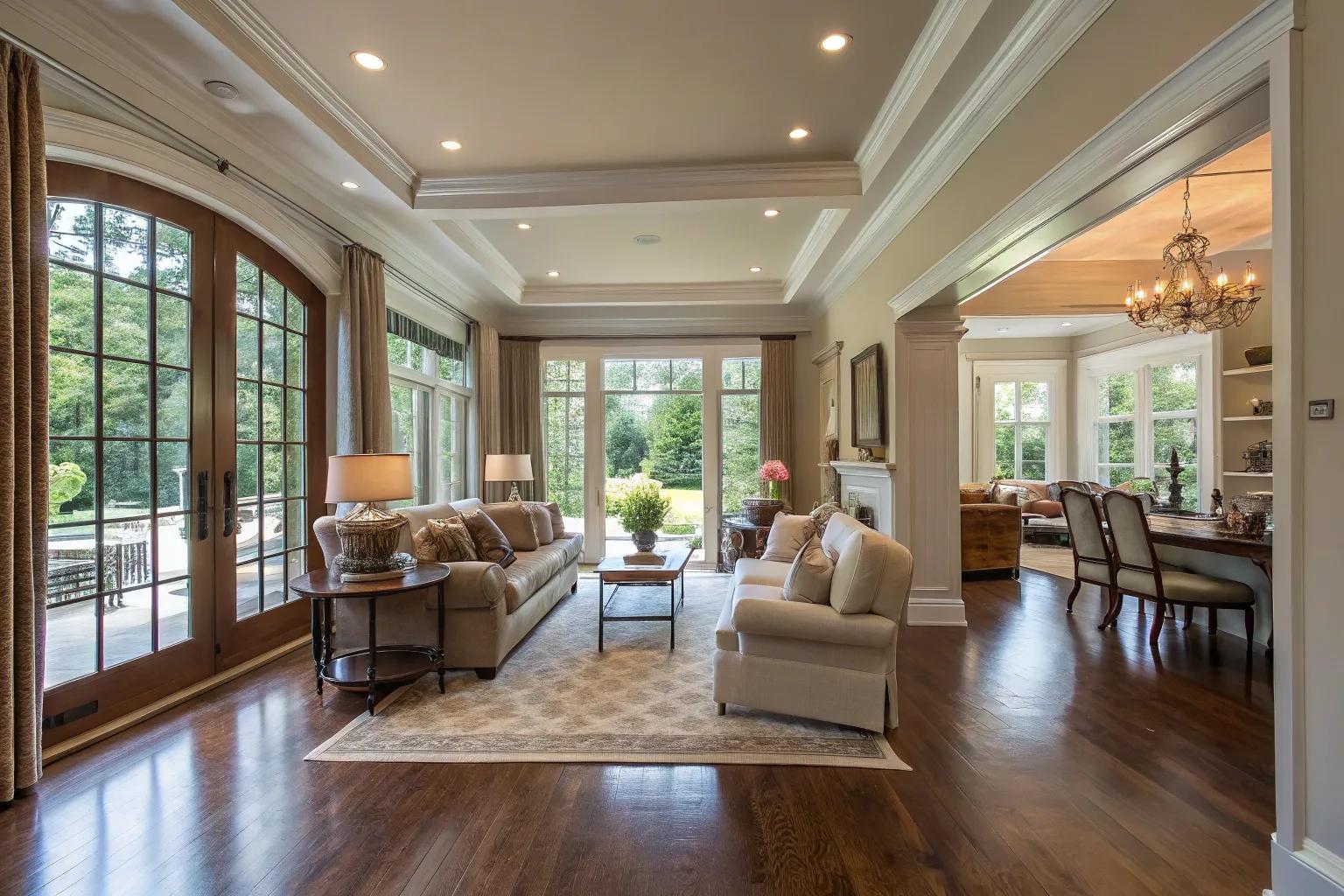
Somewhere in a lot of homes, there's a living room with a problem nobody quite knows how to name. It's not too small, exactly. It's not badly shaped, exactly. But it has three, sometimes four doorways cut into it, a hallway entrance here, a door to the kitchen there, maybe a sliding door to a patio and a staircase landing besides, and every attempt to arrange furniture in it turns into a puzzle where every wall is interrupted before it really gets started. The room ends up feeling less like a living room and more like an intersection people happen to sit down in.
This is an unusually common problem, especially in homes built from the 1970s through the 2000s, where open-concept adjacency and multiple points of entry were treated as a selling point without much thought given to what that meant for actually furnishing the resulting space. Split-level homes, homes with a staircase landing that opens directly into the main living space, and homes where a living room sits at the literal center of the floor plan, connecting a front entry, a kitchen, a hallway to the bedrooms, and sometimes a garage entrance all at once, tend to have the worst version of this specific problem.
It's also a problem that gets solved badly more often than it gets solved well, because the instinct in a room like this is almost always to push furniture against whatever wall space remains, which tends to leave the room feeling scattered, undersized, and strangely impossible to sit comfortably in no matter how it's rearranged. People often blame the room itself, describing it as "just an awkward space," when the more accurate description is that it's a room that's never actually been planned around its doorways as fixed, permanent features, the way a designer would plan around a room's genuine dimensions.
This article works through six specific, repeatable layout strategies for exactly this kind of room, a living room with multiple doorways competing for wall space. Each one includes the underlying problem it solves, why it gets overlooked, the actual steps to execute it, a realistic cost range, and the reasoning behind why it works. None of these require moving a door, an interior wall, or anything structural, every fix here works with the doorways exactly as they already exist.
A brief, honest note before starting: the specific dollar figures below are realistic, checkable, current mid-range retail estimates for the categories of item described, not a receipt from one particular verified purchase. The techniques and reasoning are genuine and worth trusting as a planning benchmark, the "before" scenes are composite, illustrative situations built to make each layout problem concrete and recognizable, representative of the kind of multi-door living room a lot of people are actually dealing with, rather than one specific documented home.
It's also worth being upfront about what this article doesn't cover. None of the six fixes below involve moving, removing, or widening a doorway, that's genuine construction work requiring a contractor, and in the case of load-bearing considerations, a structural engineer, well outside the scope of a layout fix. What follows is entirely about working with the doors exactly where they already are, and it turns out there's a great deal that can be done from that starting point alone.
One more framing point before getting into the specifics: a room with multiple doorways is not a smaller or lesser version of a normal living room, it's a genuinely different design problem with its own internal logic, closer in some ways to designing a hotel lobby or a transitional gallery space than a conventional single-entry room. Once that reframe happens, the goal stops being "make this room work like a normal living room despite the doors" and becomes "design specifically for a room whose job includes being a crossing point," which turns out to be a solvable, even interesting, problem rather than a permanent inconvenience.
Table of Contents
- Floating the Furniture Away From the Traffic Lanes
- Using a Rug to Define the Room Instead of the Walls
- Turning One Doorway Into the Room's Actual Backdrop
- A Low Divider to Separate Path From Seating
- Angling the Seating Group Off the Room's Main Axis
- Treating Every Doorway as a Framed View, Not a Gap
- Reading Your Specific Door Configuration First
- Why These Six Work Together
- The Core Principle Behind Every Multi-Door Room
- How This Compares to Removing a Doorway
- What This Won't Fix
- Adapting for Renters vs. Homeowners
- Lighting Considerations Specific to Multi-Door Rooms
- Staying Under Budget
- Common Mistakes
- Which Fix to Start With
- Full Cost Breakdown
- Common Questions
Floating the Furniture Away From the Traffic Lanes
The problem: in a room with three or four doorways, the instinct to push every piece of furniture flush against a wall runs straight into a room where there simply isn't enough uninterrupted wall left to do that. The sofa ends up jammed into whatever fragment of wall remains between two doorways, often facing an awkward diagonal, while the rest of the furniture gets scattered wherever it fits, chasing leftover wall space instead of a coherent layout.
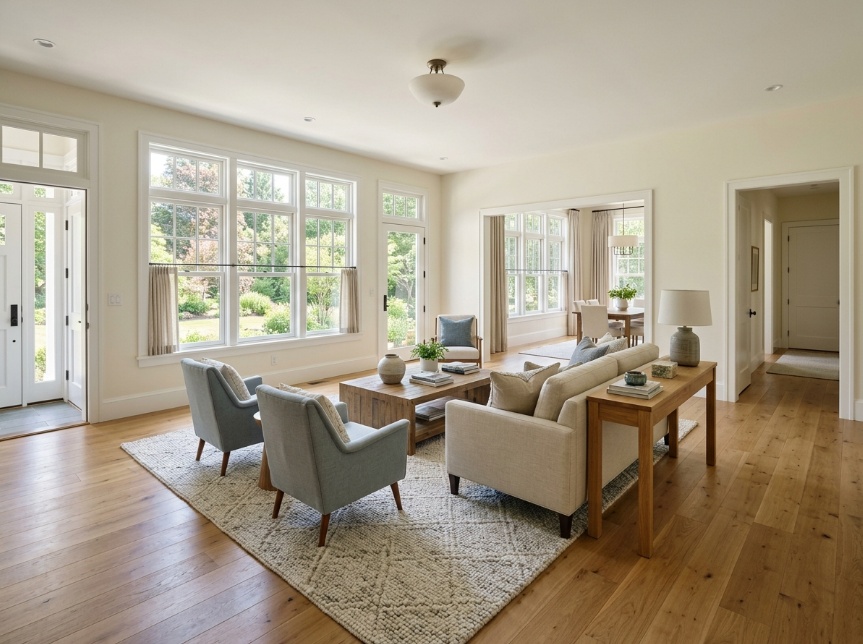
The actual fix runs directly against that instinct. Instead of anchoring furniture to the walls, which is exactly what's scarce and interrupted in this kind of room, the furniture gets floated toward the room's center, arranged around where people will actually sit rather than around whatever wall happens to be free. This sounds counterintuitive in a room that already feels short on space, but it's usually the single highest-impact change available in a multi-door living room specifically because it stops competing for a resource, continuous wall, that the room simply doesn't have enough of.
The key mechanical detail is mapping the traffic lanes first, the actual paths people need to walk between each doorway, before placing a single piece of furniture. Once those paths are marked out, whatever space remains outside them becomes the seating zone, regardless of which walls that zone happens to touch or not touch. It's worth noting that this mapping step is where most attempted fixes to this kind of room go wrong even when the underlying instinct, floating the furniture, is correct: without marking the lanes first, it's very easy to float furniture into a spot that still blocks a path, simply relocating the original problem rather than solving it.
There's also a psychological hurdle worth naming honestly. Furniture floated away from the walls can, for the first few days, feel exposed or unfinished purely because it breaks a lifetime of visual habit around how rooms are "supposed" to look. That feeling generally fades within a week of actually living with the new arrangement, and it's worth pushing through it rather than reverting back to the wall-hugging default at the first sign of unfamiliarity.
| Item | Cost |
|---|---|
| Furniture sliders for repositioning heavy pieces | $10 |
| Painter's tape for marking traffic lanes during planning | $4 |
| Total | $14 |
- Walk between every pair of doorways in the room and mark the natural, most direct path with painter's tape on the floor, this reveals the actual traffic lanes rather than an assumed or guessed-at version of them.
- Identify whatever floor space remains once all the traffic lanes are marked, this is the room's real usable seating zone, regardless of how it relates to the surrounding walls.
- Position the sofa as the anchor piece first, floated within that zone rather than backed against any particular wall, using its back to help visually separate the seating area from an adjacent traffic lane where possible.
- Add chairs and a coffee table within conversational distance of the sofa, inside the same zone, checking that no piece obstructs any of the taped traffic lanes.
- Walk the room again with the new furniture in place, confirming every doorway is still reachable without squeezing between furniture or stepping around a piece that juts into a lane.
- Remove the tape once satisfied with the arrangement, or leave it briefly as a working reference while making small adjustments over the following days.
The result: the same doorways, the same walls, but a seating area that finally reads as a defined room rather than furniture scattered around the edges of a busy intersection.
- This fix costs almost nothing and is entirely reversible, yet it's frequently the single highest-impact change available in this specific kind of room
- Floated furniture arrangements are a hallmark of professionally designed open-concept spaces for exactly this reason
- Mapping traffic lanes first prevents the trial-and-error furniture shuffling that otherwise eats an entire weekend
Search terms: "furniture moving sliders," "painter's tape floor marking," "living room floating furniture layout"
Using a Rug to Define the Room Instead of the Walls
The problem: in a room where the walls are constantly interrupted by doorways, using the walls to define where the "living room" actually begins and ends doesn't work particularly well, there simply isn't enough continuous wall to draw a clear boundary from. The room's edges blur into the hallway, the kitchen, and whatever else sits just beyond each doorway, and the space can end up feeling like it has no real boundary of its own at all.
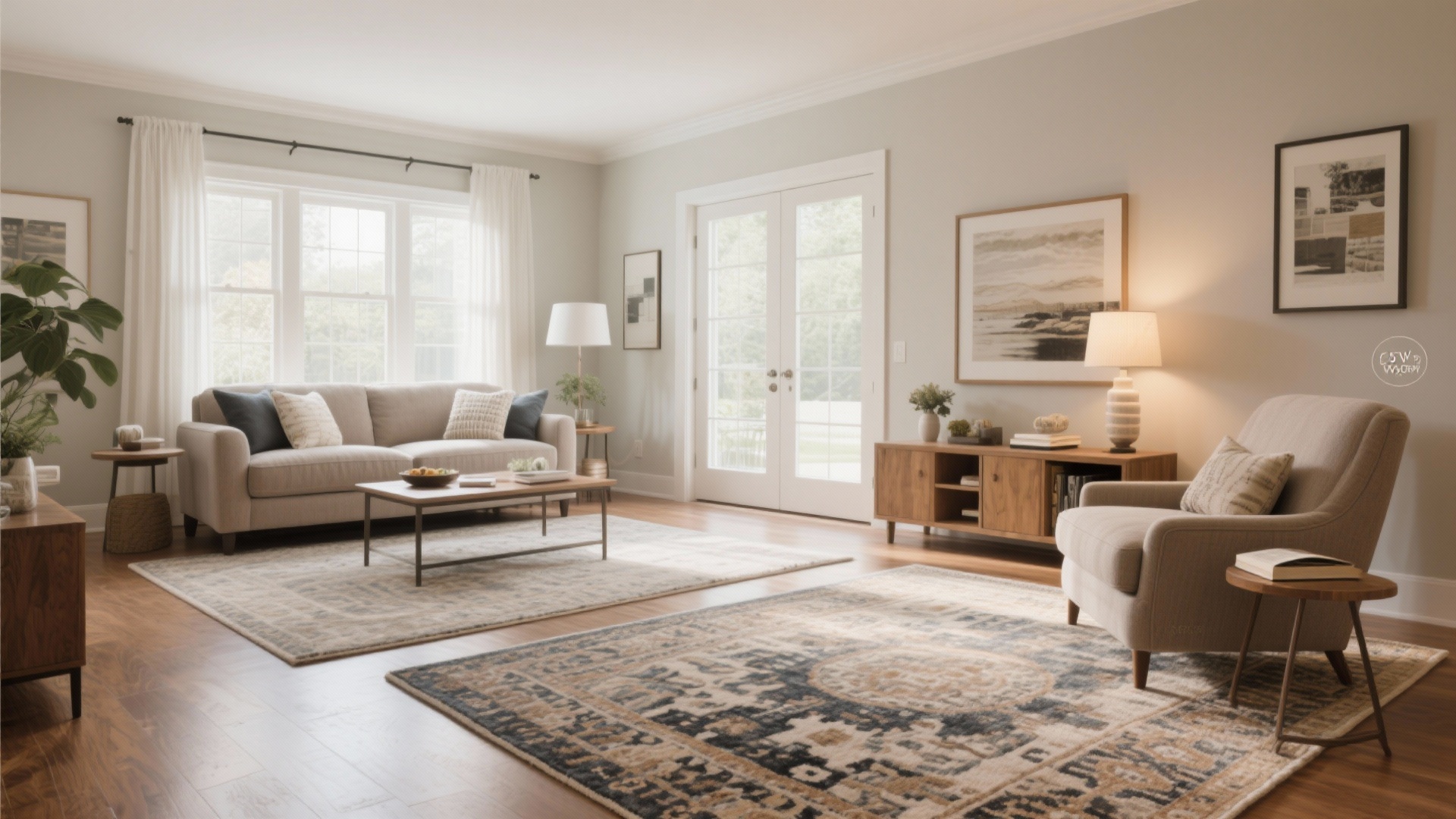
A large, well-placed rug solves this by defining the room from the floor up rather than relying on the walls to do that job. Since a rug's edges are entirely independent of where the doorways happen to fall, it can mark out exactly where the living room "is" regardless of how chopped-up the surrounding walls are, giving the eye a clear, consistent boundary that the architecture itself doesn't provide.
This is a slightly different application of rug sizing than in a standard living room, in a multi-door room the priority shifts from purely "does the furniture fit on it" to "does this rug visually claim a defined territory distinct from the traffic lanes running through and around it," which sometimes means sizing it a bit more generously than the furniture alone would require.
Color and tone choice matters more here too than in a typical living room. A rug that closely matches the flooring visible through an adjacent doorway can accidentally blur the very boundary it's meant to create, while a rug with a noticeably different tone or texture from whatever flooring continues into the hallway or kitchen reinforces the sense that you've stepped into a distinct room the moment you cross onto it, even without a threshold or a change in flooring material to mark the transition physically.
| Item | Cost |
|---|---|
| Large area rug, sized generously for the seating zone | $75 |
| Rug pad | $15 |
| Total | $90 |
- Determine the seating zone first, using the floated furniture arrangement and traffic lanes established earlier as the basis, rather than the room's total floor area.
- Size the rug to extend a bit beyond the seating furniture itself, enough that its edges read as a clear boundary even from a doorway several feet away, rather than sizing it minimally to just fit under the furniture.
- Keep the rug's edges clear of the marked traffic lanes where possible, so the boundary it creates lines up with the natural paths through the room rather than cutting across them awkwardly.
- Choose a rug tone or pattern that reads clearly as a distinct zone from any adjacent flooring, a noticeably different tone from an adjoining hallway or kitchen floor reinforces the boundary more than a rug that blends closely with what's around it.
- Add the rug pad underneath both for comfort and to prevent the rug shifting under regular foot traffic passing near its edges.
- Stand at each doorway into the room after placing the rug and confirm the seating zone reads as a clearly separate space from that vantage point, adjusting placement slightly if any doorway still makes the boundary feel ambiguous.
The result: the same open, doorway-heavy floor plan, but a living room that reads as a genuinely separate, defined space rather than a wide spot in a busy hallway.
- A well-placed rug does the architectural work of a wall without any construction at all
- This is a technique interior designers rely on constantly in open-concept and multi-entry spaces specifically
- The rug's boundary reads clearly from every doorway, reinforcing the room's identity from multiple angles at once
Search terms: "large area rug living room," "rug pad non slip," "open concept rug boundary"
Turning One Doorway Into the Room's Actual Backdrop
The problem: when a room has several doorways competing for attention, sofas often end up facing whichever direction avoids the most doors, which frequently means facing directly into another doorway or a busy sightline instead of toward anything worth looking at. The seating ends up oriented reactively, based on what to avoid, rather than deliberately, based on what it should face.
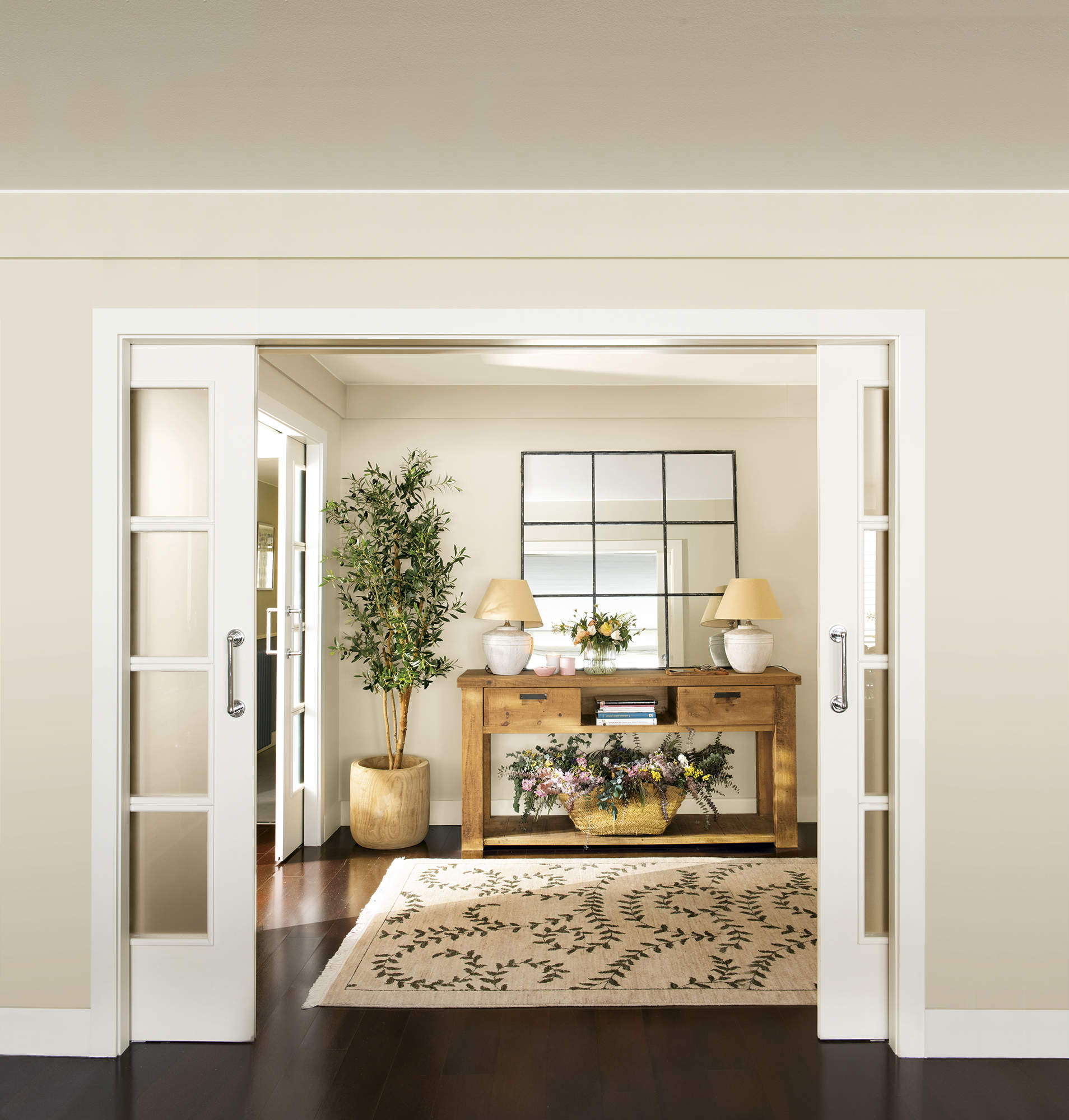
The fix is choosing one specific doorway, ideally the least-trafficked of the group, and treating whatever's visible through and around it as the room's actual visual backdrop, then orienting the primary seating to face that direction on purpose. Instead of every doorway being treated as an equal interruption to work around, one gets elevated into the room's intentional focal direction while the others recede into the room's periphery.
This works particularly well when the chosen doorway leads somewhere with a naturally attractive view, a window on the far side of an adjoining hallway, a glimpse into a well-lit kitchen, but it's a workable technique even when the view beyond is fairly plain, since a piece of furniture or art placed just inside that doorway's sightline can become the deliberate focal point instead.
It's worth spending an actual evening testing this rather than deciding from a quick glance. Sit in the exact spot the sofa will occupy at a few different times of day, morning, midday, evening with the lamps on, since a doorway that looks unremarkable at noon can become the room's best feature once evening light or lamp glow hits whatever's visible just beyond it, and the reverse is equally true.
| Item | Cost |
|---|---|
| Console table or small piece to anchor the chosen doorway's sightline | $45 |
| Art or mirror to place within that sightline | $28 |
| Total | $73 |
- Sit in the approximate spot the sofa will occupy and look toward each doorway in turn, noting which one offers the best natural view, the most light, or simply the least visual clutter beyond it.
- Choose that doorway as the room's primary orientation and turn the main seating to face generally toward it, even if it means facing slightly away from one or more of the other doorways.
- If the space visible through the chosen doorway is fairly plain, place a console table, a piece of art, or a mirror just inside or just beyond it, specifically within the sightline from the seating, to give the eye something deliberate to land on.
- Check the view from the seating at different times of day, since natural light through a doorway can shift considerably between morning and evening, affecting how well the chosen backdrop actually reads.
- Adjust the exact angle of the seating slightly if the initial orientation ends up facing a blank stretch of wall beside the doorway rather than the doorway itself.
- Leave the other doorways as secondary, functional openings rather than trying to visually address each of them individually, the goal is one clear focal direction, not equal treatment for every opening.
The result: the same set of doorways, but seating that finally faces somewhere on purpose, giving the whole room a clear visual direction instead of a defensive arrangement built entirely around avoidance.
- Deliberate orientation toward a chosen view is a core technique in professionally designed open-concept spaces
- This turns a structural limitation, multiple doorways, into an actual design feature rather than something to just work around
- A small anchor piece placed within the sightline costs little but gives the whole room's orientation a clear sense of purpose
Search terms: "console table entryway," "wall mirror living room," "living room focal point ideas"
A Low Divider to Separate Path From Seating
The problem: even after floating furniture toward the room's center and mapping out traffic lanes, some multi-door rooms still have a specific path that cuts uncomfortably close to the seating area, close enough that anyone walking through feels like they're stepping directly through the middle of a conversation rather than around it.
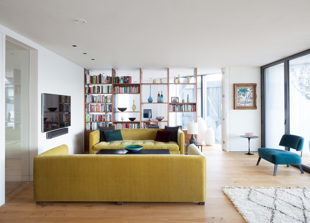
A full wall obviously isn't an option here, and typically isn't wanted anyway, part of what makes an open, multi-door layout appealing is the connectivity between spaces. What works instead is a low, visually permeable divider, something like an open bookshelf, a low console table, or a slim bench, placed along the edge where the traffic lane and the seating zone meet. It's tall enough to register as a boundary but low enough, and open enough, to preserve sightlines and the sense of connection between spaces.
This is a more targeted, higher-commitment version of what the rug does visually, where the rug marks a soft boundary on the floor, a low divider adds a genuine physical one, useful specifically when a traffic lane runs close enough to the seating that a floor-level boundary alone isn't quite enough to keep the space feeling separated.
Height is the single most important measurement in this fix, and it's worth getting precise about it rather than eyeballing. Roughly waist height, somewhere around 28 to 34 inches for most adults, tends to be the sweet spot, tall enough to register clearly as a boundary from a seated position on the sofa, low enough that someone standing on either side can still see clearly across it and hold a conversation with someone on the opposite side without leaning around it.
| Item | Cost |
|---|---|
| Low open bookshelf or console, sized to the gap | $85 |
| A few styled objects or books for the shelf | $15 |
| Total | $100 |
- Identify the specific traffic lane that runs closest to the seating zone, using the earlier taped-out paths as a reference, this is the one lane that actually needs a physical boundary rather than just a visual one.
- Measure the length of that boundary line precisely before shopping, since an oversized divider will start blocking the traffic lane itself rather than just marking its edge.
- Choose a piece under about waist height, tall enough to register clearly as a boundary from a seated position, low enough that it doesn't block sightlines or make the room feel chopped up when standing.
- Favor an open-backed design, an open shelving unit rather than a solid-backed cabinet, so light and sightlines pass through it even while it functions as a physical divider.
- Position the piece precisely along the boundary line identified earlier, double-checking that the traffic lane on one side remains fully clear and unobstructed.
- Style the shelf lightly, books, a small plant, a couple of decorative objects, keeping it under about two-thirds full so it still reads as open and doesn't visually become a solid wall from a distance.
The result: the same open connection between spaces, but a seating area that no longer feels like it's being walked through, since the busiest nearby path now has a clear, low physical edge separating it from the conversation area.
- A low open divider does the job of a wall without sacrificing the connected, open feel that made the layout appealing in the first place
- It adds genuine, everyday storage or display space, unlike a rug or purely visual boundary
- This is a technique used constantly in professionally designed open-concept homes for exactly this scenario
Search terms: "low open bookshelf room divider," "console table open shelving," "low profile room divider"
Angling the Seating Group Off the Room's Main Axis
The problem: in a room with doorways on multiple walls, keeping every piece of furniture aligned strictly parallel or perpendicular to the walls, the default, most common arrangement, often means the seating group ends up sitting directly in line with one or more doorways, creating a straight, uninterrupted sightline, and sometimes a straight walking temptation, right through the middle of the conversation area.
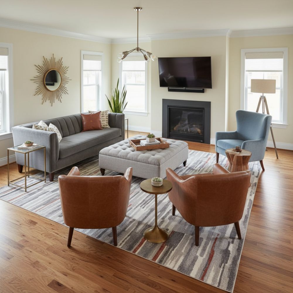
Rotating the entire seating group off that main axis, angling the sofa and chairs somewhere between 15 and 45 degrees relative to the walls, breaks that direct alignment. It's a technique used far more often in professional design than most people realize, since a slight angle does two things at once: it visually softens a boxy, doorway-heavy room, and it naturally discourages anyone from treating the seating area as a shortcut between two doorways, since an angled arrangement doesn't offer the same straight, obvious walking line a squared-off one does.
This fix pairs particularly well with the floated furniture approach covered earlier, since furniture that's already off the walls has much more freedom to be angled than furniture pushed flush against them. It's also worth noting that the angling technique tends to work best once the rug from the second fix is already in place, since the rug's own footprint gives a natural, visual reference point for how far to rotate the furniture, rather than trying to judge the angle against the room's bare, and often visually confusing, walls alone.
| Item | Cost |
|---|---|
| Furniture sliders for repositioning at an angle | $10 |
| Total | $10 |
- Identify whether any two doorways in the room sit roughly across from each other, creating a straight sightline through the space, this is the specific situation this fix targets most directly.
- Rotate the sofa somewhere between 15 and 45 degrees off the wall it's nearest to, rather than keeping it perfectly parallel, using a rug corner or a piece of tape as a temporary angle reference while adjusting.
- Angle the accompanying chairs to face the sofa at a natural conversational angle, rather than squared off in a straight line, reinforcing the rotated, less rigid feel of the whole grouping.
- Reposition the coffee table centrally within the newly angled group, rather than aligned to the room's walls, so the entire seating cluster reads as one rotated unit rather than a mix of angled and squared pieces.
- Walk the previously straight sightline between the two opposing doorways again, confirming the angled furniture has genuinely broken up the direct line of sight and the direct walking temptation through the seating area.
- Live with the angled arrangement for several days, since it can feel unfamiliar at first purely due to habit, most people find it reads as more intentional and more comfortable within a short adjustment period.
The result: the same furniture, the same doorways, but a seating area that no longer sits directly in the crossfire of a straight sightline between two openings, and reads as noticeably more deliberate as a result.
- This costs essentially nothing yet is one of the more distinctive, professionally-associated layout techniques on this entire list
- An angled arrangement softens a boxy, doorway-heavy room more effectively than almost any other single change
- It's fully reversible in minutes if the angled arrangement doesn't end up suiting the space
Search terms: "furniture moving sliders," "angled sofa layout ideas," "living room furniture angle placement"
Treating Every Doorway as a Framed View, Not a Gap
The problem: once the seating area itself is sorted, floated, angled, and defined by a rug, the doorways themselves often still read as plain, unfinished gaps in the room's walls, especially compared to how carefully the seating area has now been considered. A living room can have a genuinely well-planned layout and still feel unfinished if every doorway around its edges looks like an afterthought.
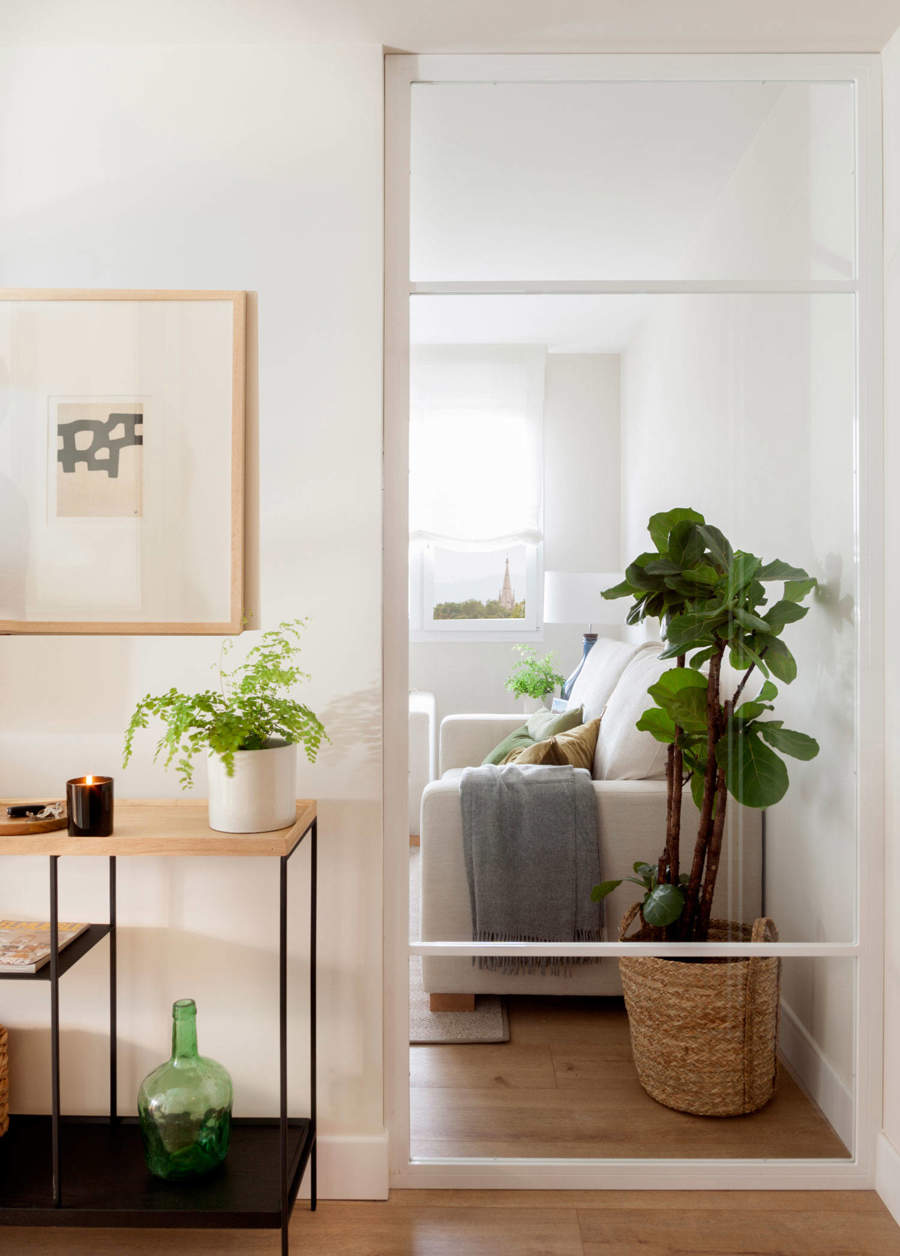
The fix here is treating each doorway the way a designer would treat a window, as a frame around whatever's visible through it, worth a small amount of deliberate attention rather than being left as a plain gap. This doesn't mean adding doors or curtains to every opening, in most cases that would work against the open, connected feel of the room. It means small, considered touches at the edges of each doorway, molding touch-ups, a coordinated paint treatment, a small piece of art or a plant placed just to one side, that acknowledge the doorway as a real architectural feature instead of an ignored interruption.
This is the finishing layer that ties the previous five fixes together, once the seating area is intentional and well-defined, giving the same level of intention to the doorways framing it is what pushes the whole room from "arranged" to "genuinely finished."
It's also worth thinking about doorway framing as an opportunity to subtly reinforce the room's chosen focal direction from the third fix. The doorway chosen as the visual backdrop deserves the most attention of all, since it's already carrying the most visual weight in the room, while the remaining, more secondary doorways can be treated more lightly, a simple trim touch-up alone is often enough for those, reserving the more elaborate styling, art, plants, a coordinated object, specifically for the one opening doing the most visual work.
| Item | Cost |
|---|---|
| Touch-up paint for door trim and molding | $16 |
| Small plant or object for one doorway's edge | $18 |
| Small art piece for a second doorway's edge | $20 |
| Total | $54 |
- Inspect the trim and molding around each doorway for scuffs, chips, or mismatched paint, this is the most common reason doorways read as neglected even in an otherwise well-kept room.
- Touch up any chipped or scuffed trim with matching paint, working in thin coats and extending slightly past the damaged area for a seamless blend rather than a visible patch.
- Choose one or two of the room's doorways, ideally ones not already treated as the primary sightline from the earlier fix, and place a small plant, a piece of art, or another styled object just to one side of the opening.
- Keep the placed objects modest in scale relative to the doorway itself, the goal is acknowledging the opening exists as a deliberate feature, not building an elaborate display around every single one.
- Step back and view the room from its main seating position, checking that each doorway now reads as an intentional part of the room's overall composition rather than a series of overlooked gaps.
- Repeat the touch-up process seasonally or as needed, since trim around a heavily used doorway tends to pick up scuffs faster than most other surfaces in the room.
The result: the same number of doorways, but a room where each opening now reads as a considered part of the space's design rather than an interruption the rest of the room was arranged around avoiding.
- This is the finishing detail that makes the previous five layout fixes read as complete rather than partially done
- Trim touch-ups are one of the cheapest possible improvements relative to how much visible wear they correct
- Treating doorways as intentional features rather than gaps is a subtle but consistent hallmark of professionally finished rooms
Search terms: "trim touch up paint," "small plant doorway styling," "small wall art living room"
Reading Your Specific Door Configuration First
Not every multi-door living room has the same underlying shape of problem, and it's worth spending a few minutes identifying which specific configuration you're actually dealing with before applying all six fixes evenly, since some configurations call for heavier emphasis on certain fixes than others.
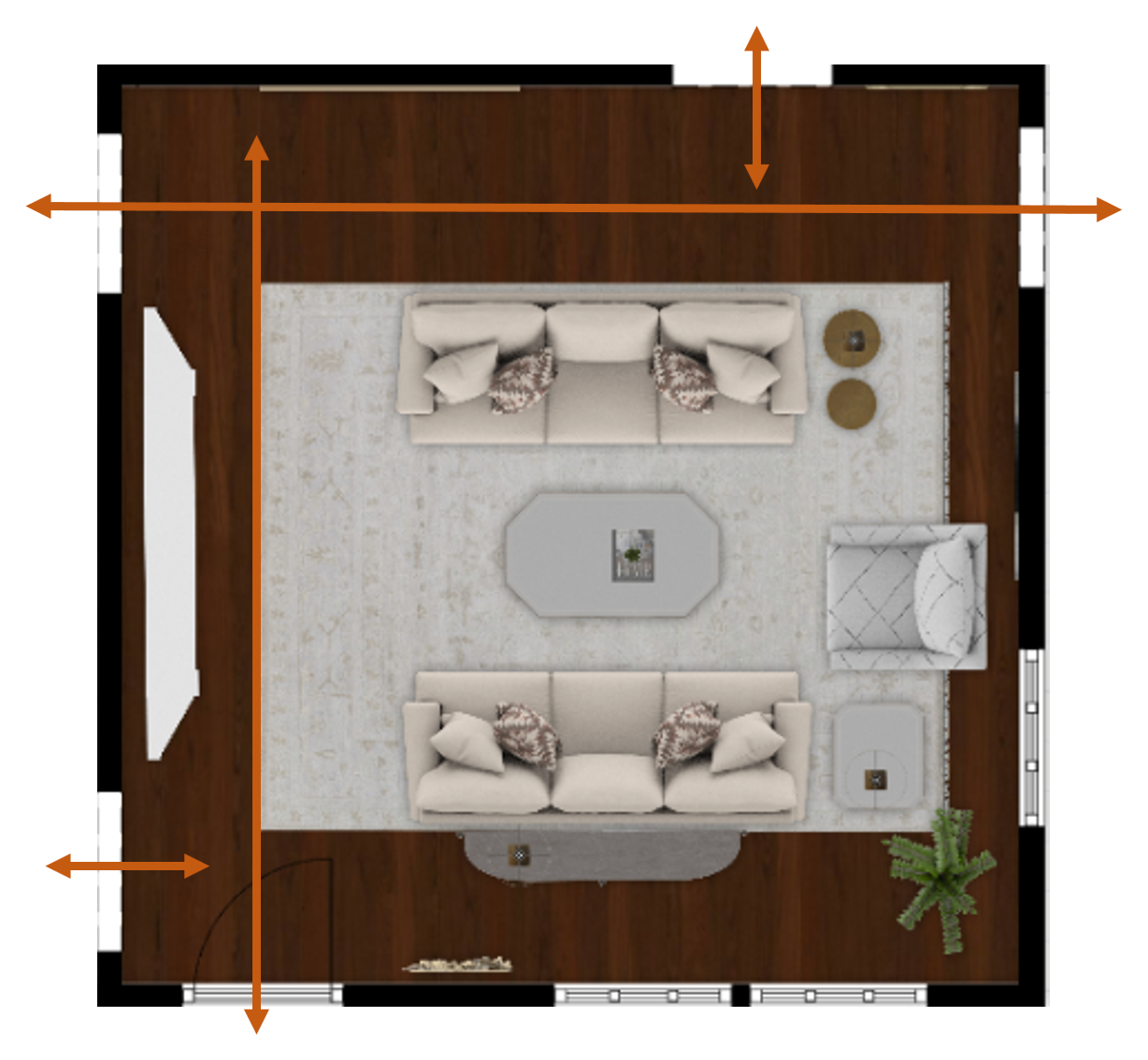
Two doorways directly across from each other creates the straight-sightline problem most directly, and the angling fix from earlier is the single most important tool for this specific layout, since it's purpose-built to break up exactly this kind of alignment.
Three doorways clustered on adjacent walls, meeting near one corner tends to leave a genuinely awkward, hard-to-use pocket of space in that corner. The diagonal seating variation mentioned in the angling fix, orienting the whole group into that corner rather than away from it, is usually the most effective response to this specific configuration.
Doorways spread across all four walls, the most challenging version of this problem, generally needs all six fixes working together rather than leaning heavily on any single one, since no single wall offers enough continuous space to anchor the room on its own, floating, defining with a rug, and choosing one deliberate focal direction all become correspondingly more important.
One dominant wide opening, like an open archway to a dining area or kitchen, alongside one or two standard doors often works best by treating the wide opening itself as the chosen focal doorway from the third fix, since it's usually already the room's largest, most naturally attention-grabbing feature, while the smaller standard doors get the lighter, more secondary treatment described in the sixth fix.
Spending ten minutes actually sketching your room's doorway positions on paper, even roughly, before starting any of the six fixes tends to save considerable trial and error later, since it reveals which specific pattern above your room most closely matches, and therefore which fixes deserve the most attention first.
Why These Six Work Together
Each of these six fixes addresses one specific symptom of the same underlying condition, a living room where the doorways, not the room itself, have been dictating the furniture arrangement. Floating the furniture stops the layout from chasing scraps of wall space. The rug gives the room a floor-level boundary the walls can't provide. Orienting toward one chosen doorway gives the seating a clear direction instead of a defensive posture. A low divider protects the seating from a path that runs too close. Angling the group breaks up straight sightlines between opposing doors. And treating each doorway as a framed feature, rather than a gap, finishes the room's edges with the same intention given to its center.
None of these six require touching the doorways themselves, no construction, no widening, no relocating. What they require is treating the doorways as fixed, permanent facts of the room's shape, the way a designer would treat a room's actual dimensions, and building the layout around that reality rather than fighting it or apologizing for it.
The Core Principle Behind Every Multi-Door Room
If there's one idea underlying all six fixes, it's this: in a room with multiple doorways, the walls stop being a reliable organizing structure for furniture, and something else has to take over that job. Across the six fixes above, that something else is usually the floor, a rug's boundary, a divider's placement, an angled group's footprint, rather than the walls. Once that mental shift happens, from "where's the open wall" to "where's the open floor, and where do people actually need to walk," a multi-door room stops being a puzzle with no good answer and starts being a fairly solvable, if slightly unconventional, layout problem.
This same principle scales beyond just furniture placement, it's worth applying to lighting, rug choice, and even wall decor decisions throughout the room. Any time a decision in this kind of room defaults to "which wall does this go on," it's worth pausing and asking whether floor position, sightline, or traffic flow is actually the more relevant question, since in a room dominated by doorways, those three factors consistently matter more than wall space ever will.
How This Compares to Removing a Doorway
It's worth being direct about the alternative some homeowners consider: closing off or relocating a doorway entirely to simplify the room's wall space. That's genuine construction, framing, drywall, often electrical work if a light switch is nearby, and commonly runs well into four figures once a contractor is involved, more if the doorway in question turns out to be part of a load-bearing wall requiring an engineer's involvement. The six fixes above, done entirely without construction, land in the range of roughly three to four hundred dollars total if all six are done at once, and considerably less if only the highest-priority ones for your specific room are tackled.
This comparison isn't meant to suggest removing a doorway is never the right call, in some genuinely dysfunctional layouts it may be the most effective long-term solution, particularly for homeowners planning to stay long-term who've already tried working around the doorways without success. It's meant to show that for most multi-door living rooms, the actual problem is a layout that's never been deliberately planned around the doorways as fixed features, not the doorways themselves, and that specific problem is solvable without construction in the majority of cases.
What This Won't Fix
These six fixes assume the doorways themselves are staying exactly where they are, if a specific doorway placement is creating a genuine functional problem, blocking the only reasonable spot for a television, making it physically impossible to fit any seating group of a workable size, that's a more fundamental issue than a layout adjustment can solve, and is worth a conversation with a contractor about relocating or closing that specific opening.
These fixes also won't resolve a room that's simply too small for the number of doorways cut into it, in some older or more compact homes, four doorways into a genuinely small room leaves very little usable floor area no matter how cleverly it's arranged. In that specific situation, scaling down to a smaller, more minimal furniture set, rather than trying to fit a full-sized furniture arrangement into an insufficient footprint, is usually a more realistic solution than any layout technique alone.
Adapting for Renters vs. Homeowners
All six fixes above are fully rental-friendly as described, floating furniture, placing a rug, choosing a focal doorway, adding a low divider, angling the seating group, and light-touch styling around doorway edges all require zero landlord approval, no drilling, and no permanent alteration to the space.
The one item worth a small note is the trim touch-up paint in the sixth fix, most leases treat minor touch-ups to existing trim, matched carefully to the original color, as normal maintenance rather than an alteration requiring approval, but it's worth a quick check of your specific lease language before doing more than a small, well-matched touch-up in a rental. Homeowners have full flexibility here and can extend the trim touch-up into a more complete repaint or even a bold accent color on the trim if desired, well beyond what a rental touch-up would typically involve.
Lighting Considerations Specific to Multi-Door Rooms
A multi-door living room has a lighting challenge that a standard, single-entry room doesn't: light and shadow patterns from adjoining rooms and hallways spill in through every opening, sometimes in warm tones, sometimes cool, sometimes bright, sometimes dim, depending on what's happening on the other side of each doorway at any given moment. This can make the room's own lighting feel inconsistent even when the fixtures inside it are perfectly fine.
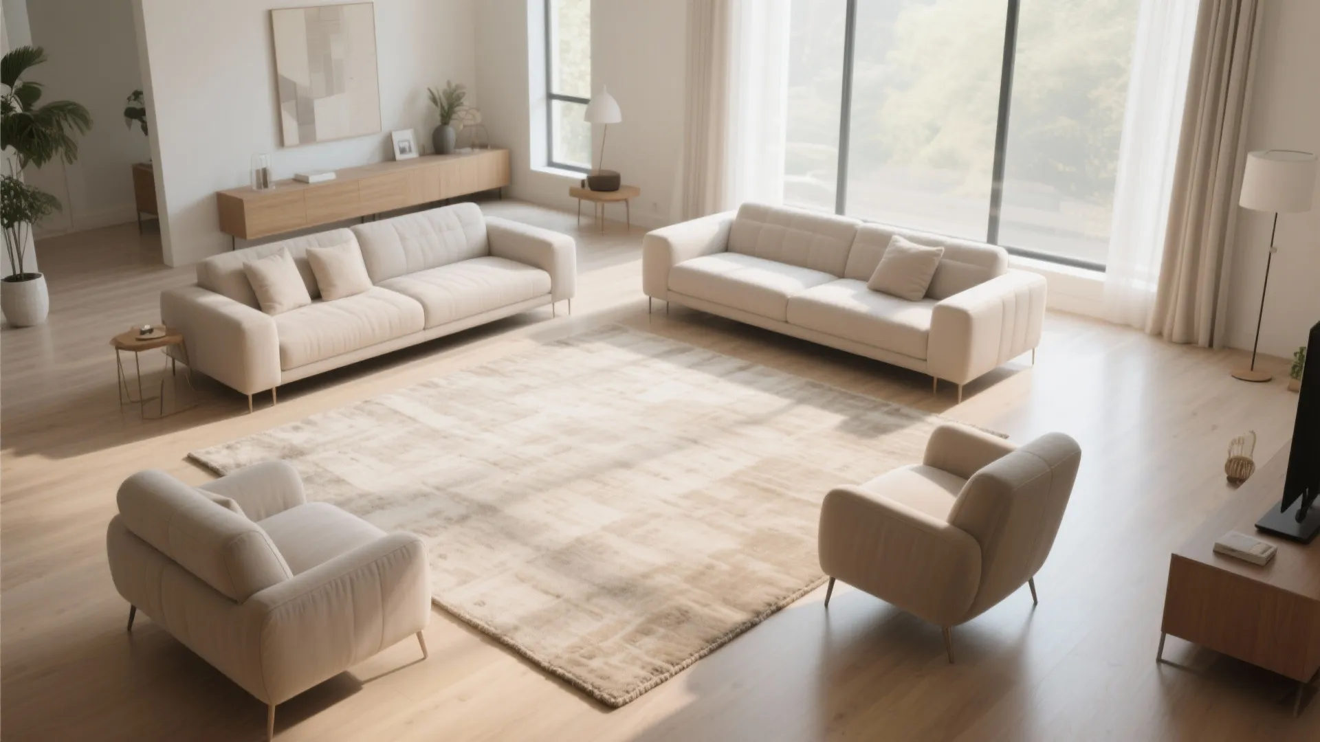
The most effective response is committing to one consistent color temperature for every light source inside the room itself, ideally warm, in the 2700K to 3000K range, so that regardless of what's spilling in from an adjacent kitchen or hallway, the room's own internal lighting reads as a coherent, deliberate whole. A floor lamp near the floated seating group, positioned to light the newly defined zone specifically rather than the room's overall floor area, reinforces the rug's boundary-setting work from fix two, extending the sense of a defined room from the floor up into the air around the seating itself.
It's also worth paying attention to which doorway lets in the most competing light during the evening, if the kitchen doorway, for instance, tends to stay brightly lit well after the living room has dimmed down, that doorway can end up unintentionally becoming the room's brightest, most attention-grabbing feature regardless of which doorway was actually chosen as the focal point in fix three. A lamp or dimmer inside the living room itself, bright enough to hold its own against that competing light, helps keep the room's chosen focal direction from getting visually overridden by whatever's happening in the next room over.
Staying Under Budget
Start with the two fixes that cost the least and require no purchases at all, floating the furniture and angling the seating group, both are essentially free and frequently produce the most noticeable single change in a multi-door room. Add the rug next, since it does the most work of any single purchase on this list toward making the room feel like a defined space. The remaining three fixes, the focal doorway styling, the low divider, and the doorway framing touches, can be added incrementally as budget allows, prioritized based on which specific problem is bothering you most in your own room.
Track spending as you go, and where possible, source the low divider and any console or shelving pieces secondhand, a sturdy frame works identically whether bought new or secondhand, and this is typically the single largest expense on the list, making it the most worthwhile place to look for savings.
Common Mistakes
- Pushing furniture against whatever wall fragments remain instead of floating it centrally: this is the single most common mistake in a multi-door room and the one that most reliably produces a scattered, disconnected layout.
- Skipping the traffic-lane mapping step before arranging furniture: without it, it's easy to end up with a seating group that technically fits but blocks a path someone actually needs to use daily.
- Sizing the defining rug too small: an undersized rug fails to create the clear boundary this specific room type needs most, sizing generously matters more here than in a standard single-entry living room.
- Adding a tall, solid divider instead of a low, open one: a solid divider sacrifices the open, connected feel that likely made the layout appealing in the first place, working against the room rather than with it.
- Leaving furniture squared to the walls when two doorways sit directly across from each other: this preserves the exact straight sightline and walking temptation the angling fix is specifically meant to break up.
- Ignoring the doorway trim and edges entirely: a well-arranged seating area can still read as unfinished if the doorways framing it look neglected by comparison.
- Trying to visually address every single doorway equally: spreading attention evenly across four or more openings dilutes the effect, choosing one clear focal doorway and treating the rest more lightly tends to work better.
- Mixing cool and warm light sources across the room: inconsistent color temperature between lamps and any spillover light from adjoining doorways undercuts the sense of a single, cohesive room.
Which Fix to Start With
- Furniture feels scattered with no clear arrangement: start with floating the furniture away from the traffic lanes, it's free and usually the most foundational fix.
- The room blends into the hallway or kitchen with no clear edge: the defining rug directly targets this exact problem.
- Seating faces a random direction with nothing to look at: choose a focal doorway and orient the seating toward it deliberately.
- A specific path cuts right past the sofa or chairs: add a low, open divider along that one boundary.
- Two doorways sit directly across from each other with a straight sightline through the seating: angle the furniture group off that axis.
- Everything else feels arranged but the room still seems unfinished: treat the doorway trim and edges as a real design feature.
Full Cost Breakdown
| Fix | Total Cost |
|---|---|
| 1. Floating the Furniture | $14 |
| 2. Defining Rug | $90 |
| 3. Focal Doorway Styling | $73 |
| 4. Low Divider | $100 |
| 5. Angled Seating Group | $10 |
| 6. Doorway Framing Touches | $54 |
| Total for all six | $341 |
| Average per fix | $56.83 |
Every individual fix lands well under a hundred dollars on its own, and even completing all six lands far below the cost of any construction-based alternative like relocating or removing a doorway, with room to trim further by skipping whichever fixes matter least for your specific room's shape.
Common Questions
Are these exact costs guaranteed everywhere? No, prices vary by region and retailer, these are realistic mid-range estimates meant as a planning benchmark, check current local pricing before finalizing your own budget.
Do all six fixes need to be done together, or can they be done individually? They can absolutely be done individually, floating the furniture and angling the seating group pair especially well as a free first pass before adding any purchased items.
What if my room only has two doorways, not three or four? These fixes still apply, particularly the rug, the focal doorway orientation, and the angling technique if the two doorways happen to sit across from each other, though a two-doorway room is generally an easier version of this same problem.
Is it possible to have too few doorways to need these fixes? A single-entry living room generally doesn't need most of these techniques, since a standard living room upgrade approach works fine when the walls remain largely uninterrupted, these six fixes are specifically calibrated for rooms where multiple entries genuinely complicate a conventional layout.
How long does it take to complete all six? The furniture floating and angling can be done in an afternoon, the rug and low divider typically take a bit of measuring and shopping time beforehand, most people complete the full set within two to three weekends of casual effort.
Should I hire a professional to help plan a layout this complicated? A one-time consultation with a designer can be worthwhile for a genuinely difficult room, but the six fixes above are specifically designed to be done independently with careful measuring and the traffic-lane mapping step, most multi-door rooms are solvable without professional help.
What if the room still feels awkward after trying all six? At that point it's worth honestly evaluating whether the furniture itself is sized appropriately for the room, an oversized sofa or sectional in a genuinely small multi-door space can undercut even a well-planned layout, and may be a separate issue from the layout technique itself.
Is it worth doing this in a room I'm planning to eventually renovate anyway? Yes, since none of these fixes involve construction, there's no wasted investment if a future renovation changes the doorway layout, everything here is either free or easily relocated to wherever the furniture ends up next.
Does the specific number of doorways change which fixes matter most? Yes, as covered in the door configuration section above, two opposing doors call for heavier emphasis on angling, while three or four doors spread across the room generally need all six fixes working together rather than leaning on any single one.
Can these techniques apply to an open-concept space that isn't technically a separate room at all? Largely yes, the rug, floating furniture, and focal orientation techniques transfer well to a living area within a larger open floor plan, though the doorway-specific fixes, framing edges and the low divider, are most directly relevant when there are actual defined openings rather than a fully open boundary-free space.
None of these six layout fixes required moving a single doorway, hiring a contractor, or any construction at all. Every one of them worked by treating the doorways as fixed, permanent facts of the room and building an intentional layout around them, rather than fighting a floor plan that was never going to change.
Start with the furniture floating tonight, it costs nothing at all, and notice how differently the room reads once the layout stops chasing scraps of wall space between the doors.
Then add the rug, choose a focal doorway, or tackle whichever specific problem is bothering you most, one fix at a time, measured against the room you actually have rather than the room you wish had fewer doors. That's the whole method behind all six of these fixes, and it applies just as well to any other awkwardly-shaped room in the house that's been quietly working against its own furniture for years.
Shop the Story
- large area rug living room
- low open bookshelf room divider
- console table entryway
- furniture moving sliders
- rug pad non slip
- small wall art living room
- trim touch up paint
- wall mirror living room