11 Coffee Table Styling Tricks Designers Swear By
Turn any coffee table into the room's focal point with these formulas
My coffee table went through two distinct, equally wrong phases. The first was bare, just the table itself, because I genuinely didn't know what belonged on it. The second was cluttered, remotes, mail, a half-finished mug, because bare had started to feel unfinished, and I filled the gap with whatever was nearby.
Neither phase felt intentional. Both, I later realized, were the result of never actually learning the handful of simple formulas designers use, not talent, not an eye for design, just a few repeatable structures that work almost regardless of the specific objects involved.
What I eventually understood is that a coffee table isn't just another surface to decorate. It's the anchor of the living room, the piece that connects the sofa to the rest of the space, and the one surface every guest sees from the moment they sit down. When it's styled well, the whole room feels more considered. When it's cluttered or bare, even beautiful furniture around it feels slightly off.
A quick note before we start: a few of the stories ahead are shared as told to me directly, and a few are offered as illustrative examples to make a principle easier to picture, I've tried to be clear about which is which rather than presenting every anecdote as independently verified.
Here are eleven of those formulas, the actual reasoning behind each one, and how to adapt them to whatever coffee table shape you actually own.
Table of Contents
- The Odd-Number Grouping Formula
- The Height Triangle
- The Tray as an Anchor
- One Living Element, Always
- The Stacked Book Base
- Leave One Corner Empty
- The Texture Rule of Three
- Scale to the Sofa, Not the Room
- The Seasonal Swap Habit
- Styling Round Versus Rectangular Tables
- The One-Object Rule for Minimalists
- Common Coffee Table Styling Mistakes
- The Full Cost Comparison
- Common Questions
The Odd-Number Grouping Formula

The single most repeated principle in every styling explanation I've ever gotten from someone with real design training: group objects in threes, not twos or fours. It sounds almost too simple to matter, and yet it's the difference between a table that looks arranged and one that looks assembled.
This isn't just an arbitrary preference. Our brains process odd-numbered groupings differently than even ones. Three objects create a natural visual rhythm that feels dynamic and complete, while two objects often feel like a pair waiting for something, and four can tip into cluttered without the breathing room that makes a grouping feel curated. Five works too, but three is the sweet spot most designers return to because it's the fewest objects that still read as an intentional grouping rather than two separate items placed near each other.
- Choose three objects of noticeably different heights, for example a stack of books, a candle, and a small sculptural object.
- Place the tallest item toward the back or to one side, never dead center.
- Layer the medium and shortest items in front, overlapping slightly rather than lined up in a row.
- Step back and confirm the grouping reads as one visual unit, not three unrelated objects placed near each other.
- Repeat this same three-item logic on a tray (Trick 3) if your table is large enough for more than one grouping.
- Creates a more dynamic, natural-feeling arrangement than matched pairs
- Avoids the stiff, overly matched-set look common in beginner styling
- Works on nearly any surface, not just coffee tables
Search terms: "small ceramic vase," "decorative object trio set," "small taper candle holder"
The Height Triangle
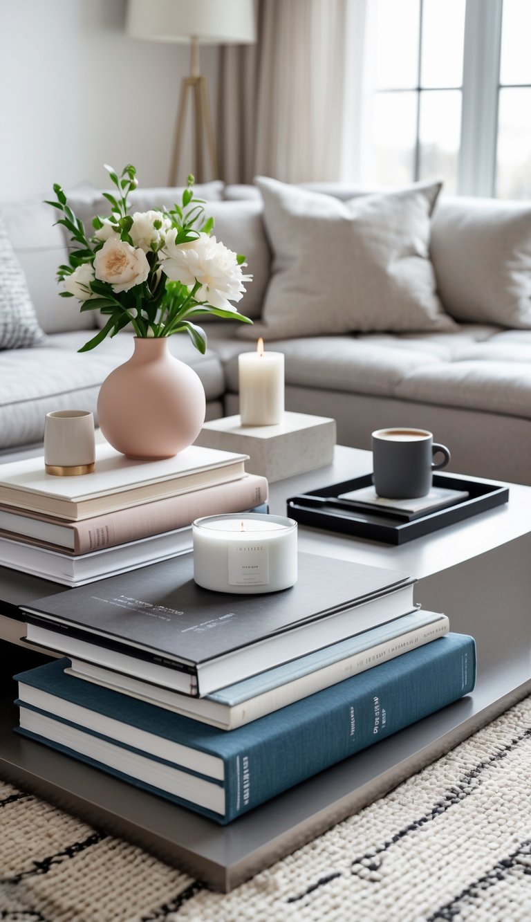
Beyond simply grouping in odd numbers, designers think specifically about the visual triangle a grouping forms, one tall point, one medium, one low, rather than three objects of similar height sitting flat next to each other.
This is sometimes called the "golden triangle" in styling, and it's the same principle that guides how galleries hang art and how retail displays are arranged. The eye naturally traces the tallest point first, then moves down through the medium and low points in a predictable, satisfying path. When all three objects sit at the same height, the eye doesn't know where to go first, and the arrangement reads as a flat line rather than a composed vignette. The triangle doesn't need to be perfectly equilateral, just distinct enough that from any angle, one object is clearly the tallest and one is clearly the lowest.
- Choose one tall anchor (a vase, a stack of larger books, a small lamp if your table allows it).
- Choose one medium-height item (a smaller candle, a low bowl with items inside).
- Choose one genuinely low, flat item (a single small object, a coaster stack, a smooth stone).
- Arrange so the eye can trace a rough triangle shape across the three points, not a straight line.
- Adjust spacing so no two items of similar height sit directly beside each other.
- Creates genuine visual depth rather than a flat arrangement
- Guides the eye naturally across the table's surface
- Applies to nearly any object category or style
Search terms: "coffee table books design," "small decorative bowl," "smooth decorative stones"
The Tray as an Anchor
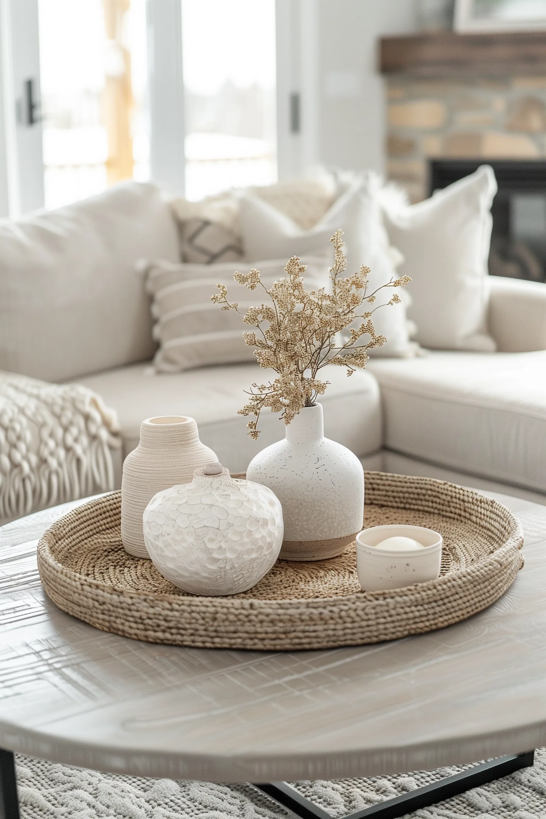
A homeowner shared that her coffee table styling never looked "finished," despite genuinely nice individual objects, until a friend suggested grouping everything onto a single tray first. The tray itself, she said, was what turned scattered objects into one cohesive vignette.
Think of a tray as a picture frame for your objects. Without it, each item sits independently on the table, and the eye has to work to connect them. With a tray, the boundary is already drawn, and everything inside it reads as one deliberate composition. This is especially useful on larger tables where objects can otherwise feel lost or unanchored. The tray also serves a practical function: when you need to clear the table for games, snacks, or cleaning, you lift one tray instead of moving several individual pieces one at a time.
- Choose a tray sized to roughly one-third to one-half of your table's total surface, leaving room elsewhere for negative space.
- Place your odd-numbered, height-varied grouping (Tricks 1 and 2) directly on the tray.
- Position the tray off-center rather than dead-center on the table for a more natural, considered feel.
- Keep the remaining table surface, outside the tray, genuinely clear rather than adding a second unrelated cluster.
- Swap the tray's contents seasonally without needing to change the tray itself.
- Visually contains a grouping into one cohesive vignette
- Makes rearranging or cleaning genuinely easier, lift one tray, not several objects
- Adds a layer of material and texture beneath the grouping itself
Search terms: "wooden decorative tray," "woven serving tray," "round coffee table tray"
One Living Element, Always

Imagine a reader who styled a beautiful, magazine-worthy coffee table arrangement entirely from decor objects, and still felt something was missing. Adding a single small stem of greenery in a bud vase was the one change that made the whole thing feel alive rather than staged.
Designers include something organic in nearly every surface styling for a reason that goes beyond aesthetics. A living element, whether it's a flowering stem, a small potted plant, or even a bowl of real fruit, signals that the space is inhabited and cared for, not just decorated and photographed. It's the difference between a hotel lobby and a living room. The specific plant or stem matters far less than the fact that it's real, fresh, and changed out regularly. A silk flower, no matter how realistic, doesn't do the same emotional work.
- Choose one small living element, a flowering stem, a small potted plant, or even a bowl of real citrus fruit.
- Keep it genuinely low-maintenance if you know you won't tend to it often, a single sturdy stem in water needs less care than a full arrangement.
- Position it as your "tall" point in the height triangle from Trick 2 if your grouping allows.
- Refresh water or replace stems regularly, a wilted living element undermines the effect faster than any other styling mistake on this list.
- Rotate between flowers, greenery, or fruit seasonally to keep the living element feeling current.
- Adds a sense of life and freshness static objects can't provide
- Signals ongoing care and attention to the space
- Easy to rotate seasonally for variety
Search terms: "small bud vase," "low maintenance houseplant small," "decorative fruit bowl"
The Stacked Book Base

A stack of three or four hardcover books, spines facing outward or inward depending on the look you want, is one of the most versatile styling bases available, and one most people already own without needing to buy anything at all.
The key to making a book stack look styled rather than accidental is consistency. A random mix of paperback thrillers and old textbooks reads as clutter. A deliberate stack of three to four hardcovers with cohesive spine colors or neutral covers reads as a design choice. Designers often remove or cover dust jackets to reveal the simpler, more textural cloth binding underneath, which usually looks more expensive and more cohesive than the glossy, colorful jacket. If you want the spines to fade into the background, turn them inward so only the cream or white page edges show, creating a monochromatic, sculptural stack.
- Choose three to four books with cohesive spine colors or covers, rather than a random mix pulled straight from a shelf.
- Stack largest to smallest for stability, with the smallest on top.
- Place one small object, a candle, a small sculptural piece, on top of the stack as a finishing touch.
- Turn spines inward, showing only the page edges, for a more minimal, monochrome look if your book covers are busy or mismatched.
- Rotate which books are used seasonally, keeping the styling feeling fresh without buying anything new.
- Uses items nearly everyone already owns
- Adds genuine height variation for the triangle formula
- Doubles as an actual functional item, not just decor
Search terms: "decorative hardcover books by color," "coffee table book set neutral," "book stack decor object"
Leave One Corner Empty
One homeowner shared that her styled coffee table always felt slightly too busy, despite following every grouping rule correctly, until she simply stopped filling one entire corner of the table on purpose.
Negative space is the single most underused styling tool in most homes. It's what gives the styled objects room to breathe and be noticed. Without it, even a perfectly composed grouping feels crowded and competes for attention. The empty corner also serves a genuine daily function: it's where you set down a drink, rest a book you're actively reading, or place the remote without it becoming part of the permanent display. Designers often call this the "living corner," the one spot on an otherwise styled surface that stays deliberately open for actual use.
- After arranging your tray and grouping (Tricks 1 through 3), look at the table's remaining open space.
- Resist the urge to fill every remaining corner with an additional object.
- Choose one corner, typically diagonal from your main grouping, to remain genuinely empty.
- Use that empty space as a practical spot for setting down a drink or a book while using the room.
- Reassess after living with the arrangement for a few days, most people find they don't miss adding anything to that empty corner.
- Prevents the table from reading as crowded or overstyled
- Creates contrast that makes the styled grouping stand out more
- Keeps the table genuinely functional for actual daily use
Search terms: "minimalist coffee table styling," "coffee table coaster set," "small drink coaster"
The Texture Rule of Three

Beyond height and quantity, designers think about texture the same deliberate way, aiming for roughly three distinct textures in a single grouping, smooth ceramic, rough woven fiber, soft organic greenery, rather than everything sharing the same finish.
Texture is what gives a grouping depth and richness that color alone can't provide. A monochromatic arrangement in all beige reads as flat and unconsidered. That same beige palette, distributed across a smooth ceramic vase, a rough woven tray, and a soft linen book cover, suddenly feels layered and intentional. The textures themselves become the visual interest, without introducing any new color at all. Designers often talk about "mixing matte, shiny, and natural" as a shorthand, each surface type reflects light differently, and that variation is what makes a grouping feel expensive rather than one-dimensional.
- Identify the texture of each object already in your grouping, smooth, matte, woven, glossy, organic.
- Aim for at least three distinct textures represented across your styled objects.
- If everything currently shares one texture (all ceramic, for instance), add one woven or organic element specifically to break the uniformity.
- Balance textures rather than letting one dominate entirely, a fully woven tray beneath fully woven objects can feel flat again in the opposite direction.
- Reassess the grouping in different lighting, texture variation often reads most clearly under natural daylight.
- Adds depth and richness that color coordination alone can't provide
- Prevents an overly matched, flat look even within one color family
- Works within any style, from maximalist to minimalist
Search terms: "woven coaster set," "raw wood decorative object," "matte ceramic vase"
Scale to the Sofa, Not the Room
A common mistake I made for years was styling my coffee table relative to how the whole living room looked from the doorway, rather than how it looked from where people actually sit, on the sofa, looking down and across at it.
This perspective shift changes almost everything about how you arrange objects. From standing height across the room, a tall vase in the center of the table might look like a beautiful focal point. From seated height on the sofa, that same vase blocks the view of the person across from you, or worse, blocks the TV. The table should be styled for the angle it's actually viewed from most often, which is nearly always seated, not standing. This also means considering sightlines: can you see across the table to talk to someone? Is the remote reachable without knocking over a carefully arranged candle? A styled table that fails functionally will be abandoned within days.
- Sit on your actual sofa and look at the table from that seated vantage point before finalizing any arrangement.
- Check that no single object blocks sightlines to the TV or conversation across the table, if that matters in your room.
- Keep the tallest elements toward the back or edges, closer to the sofa, so shorter items remain visible from a seated angle.
- Adjust height and placement based on this seated view specifically, not a standing, doorway-level assessment.
- Reassess in the evening under your actual lamp lighting, not just daytime natural light, since seated viewing happens most often then.
- Styles for the vantage point actually used daily, not just for photos
- Prevents tall objects from blocking sightlines while seated
- Makes the styling feel genuinely functional, not purely decorative
Search terms: "low profile coffee table decor," "short decorative objects table," "table styling height guide"
The Seasonal Swap Habit
One homeowner shared that her coffee table styling stopped feeling stale the moment she committed to a small seasonal swap, the same base tray and neutral objects year-round, with just one or two seasonal accents rotated every few months.
This approach solves two problems at once. First, it prevents the styling from becoming visually static, which happens faster than most people expect. Second, it keeps the cost and effort of seasonal updating genuinely manageable. You're not redecorating the entire table four times a year. You're swapping one small item, a pinecone in winter, a single bloom in spring, a smooth piece of driftwood in summer, a dried leaf in fall, while the core grouping stays exactly the same. Over time, you build a small collection of seasonal accents that rotate back in year after year, and the cost per season becomes almost nothing.
- Keep your core grouping, tray, book stack, main vase, consistent year-round as your styling foundation.
- Identify just one or two "swap slots" within that grouping specifically for seasonal accents.
- Rotate a small seasonal object into that slot, a pinecone in winter, a single bloom in spring, without touching anything else.
- Store off-season accents in a small labeled box for easy rotation next year.
- Resist the urge to buy an entirely new seasonal set each time, one or two pieces genuinely suffice.
- Keeps styling feeling current without a full redo
- Genuinely inexpensive, only one or two small items rotate
- Builds a small, reusable collection of seasonal accents over time
Search terms: "small seasonal decor accent," "dried pampas grass stem," "small decorative pinecone"
Styling Round Versus Rectangular Tables
Imagine a reader who kept applying the exact same styling formula to her new round coffee table that had worked perfectly on her previous rectangular one, and couldn't understand why it suddenly looked slightly off. The shape itself changes how a grouping should actually be arranged.
Round tables naturally draw the eye toward their center, which means a grouping placed dead center can feel overly formal or static. Off-center arrangements, placed slightly toward one side, feel more natural and leave a useful open arc on the opposite side. Rectangular tables, by contrast, benefit from a longer visual line, a rectangular tray running lengthwise, or a grouping at one end that anchors the table without competing with its full span. The mistake isn't the objects themselves, it's applying the same template to a fundamentally different shape.
- On a round table, arrange your grouping toward one side rather than dead center, leaving the opposite arc genuinely open.
- On a rectangular table, a single long tray running most of the table's length reads more naturally than a round tray centered awkwardly.
- For round tables, consider a single centered statement object (a large bowl or plant) as an alternative to an off-center grouping if the room's layout suits a symmetrical focal point.
- For narrow rectangular tables, keep groupings tighter and closer to one end rather than spread the full length, which can look sparse.
- Reassess proportion relative to the specific table's actual footprint, not a generic rule applied regardless of shape.
- Respects the table's actual geometry rather than forcing a generic layout
- Prevents the "slightly off" feeling of a mismatched formula
- Makes styling feel bespoke to the specific piece of furniture
Search terms: "long rectangular tray coffee table," "round table centerpiece bowl," "narrow decorative tray"
The One-Object Rule for Minimalists
A homeowner shared that every grouping formula in this list felt like "too much" for the genuinely minimalist home she wanted, until she landed on a single rule that fit her style specifically: one object, chosen carefully, and nothing else.
Minimalist styling is often misunderstood as simply having fewer things. But genuine minimalism in design is about each object carrying more weight because there's nothing around it to compete for attention. A single sculptural bowl on an otherwise bare table isn't sparse, it's intentional. The object itself has to earn its place through form, texture, or material interest, because it has no supporting cast. This is paradoxically one of the hardest approaches to get right, because every detail of that one object, its scale relative to the table, its finish, its placement, matters more when it's the only thing on the surface.
- Choose one object with genuine visual weight, a sculptural bowl, a single substantial vase, a beautiful stone or wood carving.
- Position it slightly off-center rather than dead center, even a single object benefits from asymmetry.
- Resist adding a "just in case" second item, the entire appeal of this approach is genuine restraint.
- Choose an object with enough texture or form interest to hold visual attention entirely on its own.
- Rotate the single object seasonally or occasionally for variety, without ever adding a second permanent piece.
- Fits genuinely minimalist interiors without feeling incomplete
- Puts full visual weight and attention on one considered choice
- Extremely low cost, since only one object is needed at all
Search terms: "sculptural decorative bowl," "single statement vase," "decorative stone sculpture"
Common Coffee Table Styling Mistakes
After years of making and observing these errors, here are the five that show up most consistently, and why each one quietly undermines an otherwise well-intentioned arrangement:
- Overcrowding every surface: filling the entire table leaves no room for the eye to rest, or for actual daily use. A coffee table is still a functional piece of furniture, not a display shelf.
- Matching everything too closely: identical materials or colors throughout reads as a matched set purchased in one trip, not a curated collection gathered over time.
- Ignoring function entirely: a table styled so precisely it can't hold an actual drink or remote quickly falls apart in daily life, and the styling gets abandoned rather than adjusted.
- Styling only for standing-height photos: missing how the table actually looks and functions from a seated position, which is where it's experienced nearly all the time.
- Letting living elements go stale: a wilted stem or dead plant undermines an otherwise well-composed grouping faster than anything else on this list, because it signals neglect rather than care.
The Full Cost Comparison
For transparency, here's what building a coffee table grouping typically costs, from budget to investment level:
| Element | Typical Cost |
|---|---|
| Decorative tray | $15–45 |
| Small vase or bud vase | $10–30 |
| Candle or small sculptural object | $10–35 |
| Coffee table book set | $0–40 (using owned books) |
| Small living plant or fresh stem | $3–20 |
| One statement single object (minimalist approach) | $25–90 |
| Full grouping, most budgets | Typically $50–120 total |
| High-end designer grouping (all new) | $150–400+ |
The difference between the budget and high-end version is rarely visible to guests. The formulas, not the price tags, do the actual styling work.
Common Questions
How often should I actually restyle my coffee table? A full restyle isn't necessary often; the seasonal swap habit (Trick 9) keeps things feeling current with minimal ongoing effort. Most designers do a light refresh quarterly and a more considered update once or twice a year.
Which trick matters most if I can only apply one? The odd-number grouping formula (Trick 1) has the broadest impact and works as the foundation nearly every other trick builds on. Start there, and the rest will layer in naturally over time.
Do these formulas work with a glass-top coffee table specifically? Yes, though a tray becomes even more useful there, it prevents small object feet from scratching glass and defines the grouping clearly against a transparent surface that would otherwise make objects look like they're floating unanchored.
What if I have kids and can't leave breakable objects out? Choose sturdier natural materials, wood, stone, thick ceramic, over fragile glass or delicate pieces. The same grouping formulas apply regardless of material durability. A wooden bowl, a thick woven basket, and a sturdy potted plant follow all the same rules without the breakage risk.
How do I know if my coffee table is the right size for my sofa? A good rule of thumb: the coffee table should be roughly two-thirds the length of your sofa and sit about 14–18 inches away from the sofa's front edge. If your table is significantly smaller or larger than that proportion, adjust your styling density accordingly, a small table benefits from the one-object rule (Trick 11), while an oversized table may need two separate tray groupings to avoid looking sparse.
A coffee table was never actually about owning the right decorative objects. Every trick here proves the same point: a handful of repeatable formulas, quantity, height, texture, and restraint, do more real styling work than any single beautiful item placed without a plan.
The objects themselves can be thrifted, borrowed from other rooms, or collected slowly over years. What makes them work isn't their price tag or brand, it's the structure they're arranged within. That structure is free, learnable, and works on any table, in any home, at any budget.
Start with the free one this weekend, grouping in odd numbers and leaving one corner empty, and notice how much more intentional the exact same objects suddenly look.
Shop the Story
- wooden decorative tray
- small ceramic vase
- coffee table book set neutral
- low maintenance houseplant small
- woven coaster set
- sculptural decorative bowl
- small taper candle holder
- decorative fruit bowl
- long rectangular tray coffee table
- small decorative pinecone